Getting Started with Blazor Ribbon in Web App
7 Aug 202612 minutes to read
This section explains how to add the Blazor Ribbon component to your Blazor Web App using Visual Studio, Visual Studio Code, and the .NET CLI.
To get started quickly with the Blazor Ribbon component, refer to the following video guide:
Create a new Blazor Web App
Create a Blazor Web App using Visual Studio via Microsoft Templates or the Syncfusion® Blazor Extension. For detailed instructions, refer to the Blazor Web App Getting Started documentation.
Run the following command to create a new Blazor Web App.
dotnet new blazor -o BlazorWebApp --interactivity Auto
cd BlazorWebApp
cd BlazorWebApp.Client
Alternatively, create a Blazor Web App using Visual Studio Code via Microsoft Templates, the Syncfusion® Blazor Extension, or the C# Dev Kit extension.
Run the following command to create a new Blazor Web App.
dotnet new blazor -o BlazorWebApp --interactivity Auto
cd BlazorWebApp
cd BlazorWebApp.Client
Configure the appropriate Interactive render mode and Interactivity location while creating a Blazor Web App. For detailed information, refer to the interactive render mode documentation.
Install the required Blazor packages
Install the Syncfusion.Blazor.Ribbon and Syncfusion.Blazor.Themes NuGet packages. All Syncfusion Blazor packages are available on nuget.org. See the NuGet packages topic for details. If using the WebAssembly or Auto render modes in the Blazor Web App, install these packages in the .Client project.
- Go to Tools → NuGet Package Manager → Manage NuGet Packages for Solution.
- Search the required NuGet packages (
Syncfusion.Blazor.RibbonandSyncfusion.Blazor.Themes) and install them.
Alternatively, you can install the same packages using the Package Manager Console with the following commands.
Install-Package Syncfusion.Blazor.Ribbon -Version 35.1.37
Install-Package Syncfusion.Blazor.Themes -Version 35.1.37
Open the terminal and run the following commands.
dotnet add package Syncfusion.Blazor.Ribbon -v 35.1.37
dotnet add package Syncfusion.Blazor.Themes -v 35.1.37
Open the command prompt and run the following commands.
dotnet add package Syncfusion.Blazor.Ribbon -v 35.1.37
dotnet add package Syncfusion.Blazor.Themes -v 35.1.37
Add import namespaces
After the packages are installed, open the ~/_Imports.razor file in the .Client project and import the Syncfusion.Blazor and Syncfusion.Blazor.Ribbon namespaces.
@using Syncfusion.Blazor
@using Syncfusion.Blazor.Ribbon
Register the Blazor service
Open the Program.cs file in Blazor Web App and register the Blazor service and include the required namespace reference using Syncfusion.Blazor; at the top. If the Interactive Render Mode is set to WebAssembly or Auto, register the Blazor service in Program.cs files of both the server and client projects in your Blazor Web App.
builder.Services.AddSyncfusionBlazor();Add stylesheet and script resources
The theme stylesheet and script can be accessed from NuGet through Static Web Assets. Include the stylesheet at the end of the <head> section in the App.razor file.
<link href="_content/Syncfusion.Blazor.Themes/fluent2.css" rel="stylesheet" />Include the required script references at the end of the <body> section in the App.razor file to enable Ribbon functionality.
<script src="_content/Syncfusion.Blazor.Core/scripts/syncfusion-blazor.min.js" type="text/javascript"></script>Add Blazor Ribbon component
Open a Razor file located in the ~/Pages/*.razor (for example, Home.razor) and add the Blazor Ribbon component inside the razor file.
If the interactivity location is set to
Per page/componentin the Web App, define a render mode at the top of the razor file. (For example,InteractiveServer,InteractiveWebAssemblyorInteractiveAuto). If the Interactivity is set toGlobalwithAutoorWebAssembly, the render mode is automatically configured in theApp.razorfile by default.
@* desired render mode define here *@
@rendermode InteractiveAuto
Adding a Ribbon Tab
Options in the ribbon are organized into tabs. Use the RibbonTabs tag to group all tabs and the RibbonTab tag for each individual tab.
<SfRibbon>
    <RibbonTabs>
        <RibbonTab HeaderText="Home"></RibbonTab>
    </RibbonTabs>
</SfRibbon>
Adding a Ribbon Group
To define a ribbon group under each tab, use the RibbonGroups tag directive as shown below. The Orientation property of the ribbon group defines whether the collection of items inside the group will be rendered column-wise or row-wise.
<SfRibbon>
    <RibbonTabs>
        <RibbonTab HeaderText="Home">
            <RibbonGroups>
                <RibbonGroup HeaderText="Clipboard" Orientation="Orientation.Column"></RibbonGroup>
            </RibbonGroups>
        </RibbonTab>
    </RibbonTabs>
</SfRibbon>
Adding a Ribbon Item
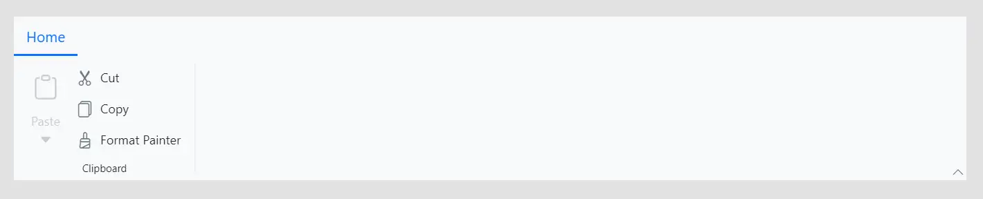
Within a group, items are organized into collections. Use the RibbonCollection tag directive for a set of items and the RibbonItem tag directive for each individual item. The Type property specifies the kind of item to render, such as a Button, DropDown, or ComboBox.
@using Syncfusion.Blazor.SplitButtons;

<SfRibbon>
    <RibbonTabs>
        <RibbonTab HeaderText="Home">
            <RibbonGroups>
                <RibbonGroup HeaderText="Clipboard">
                    <RibbonCollections>
                        <RibbonCollection>
                            <RibbonItems>
                                <RibbonItem Type=RibbonItemType.SplitButton Disabled=true>
                                    <RibbonSplitButtonSettings Content="Paste" IconCss="e-icons e-paste" Items="@formatItems"></RibbonSplitButtonSettings>
                                </RibbonItem>
                            </RibbonItems>
                        </RibbonCollection>
                        <RibbonCollection>
                            <RibbonItems>
                                <RibbonItem Type=RibbonItemType.Button>
                                    <RibbonButtonSettings Content="Cut" IconCss="e-icons e-cut" ></RibbonButtonSettings>
                                </RibbonItem>
                                <RibbonItem Type=RibbonItemType.Button>
                                    <RibbonButtonSettings Content="Copy" IconCss="e-icons e-copy"></RibbonButtonSettings>
                                </RibbonItem>
                                <RibbonItem Type=RibbonItemType.Button>
                                    <RibbonButtonSettings Content="Format Painter" IconCss="e-icons e-format-painter"></RibbonButtonSettings>
                                </RibbonItem>
                            </RibbonItems>
                        </RibbonCollection>
                    </RibbonCollections>
                </RibbonGroup>
            </RibbonGroups>
        </RibbonTab>
    </RibbonTabs>
</SfRibbon>

@code {
    List<DropDownMenuItem> formatItems = new List<DropDownMenuItem>()
    {
        new DropDownMenuItem { Text = "Keep Source Format" },
        new DropDownMenuItem { Text = "Merge Format" },
        new DropDownMenuItem { Text = "Keep Text Only" }
    };
}
Run the application
Press Ctrl+F5 (Windows) or ⌘+F5 (macOS) to launch the application. The Blazor Ribbon component will render in your default web browser.
Open the terminal and navigate to the main project folder (for example, BlazorWebApp) and run the following command.
cd ..
cd BlazorWebApp
dotnet run
Open the command prompt and navigate to the main project folder (for example, BlazorWebApp) and run the following command.
cd ..
cd BlazorWebApp
dotnet run