How can I help you?
Getting Started with Blazor TimePicker in Blazor Web App
27 Apr 20266 minutes to read
This section briefly explains about how to include Syncfusion® Blazor TimePicker component in your Blazor Web App using Visual Studio, Visual Studio Code, and the .NET CLI.
Prerequisites
Create a new Blazor Web App in Visual Studio
Create a Blazor Web App using Visual Studio via Microsoft Templates or the Syncfusion® Blazor Extension. For detailed instructions, refer to the Blazor Web App Getting Started documentation.
Prerequisites
Create a new Blazor Web App in Visual Studio Code
Create a Blazor Web App using Visual Studio Code via Microsoft Templates or the Syncfusion® Blazor Extension. For detailed instructions, refer to the Blazor Web App Getting Started documentation.
For example, in a Blazor Web App with the Auto interactive render mode, use the following commands in the integrated terminal (Ctrl+`):
dotnet new blazor -o BlazorWebApp -int Auto
cd BlazorWebApp
cd BlazorWebApp.Client
Prerequisites
Install the latest version of .NET SDK. If you previously installed the SDK, determine the installed version by executing the following command in a command prompt (Windows) or terminal (macOS) or command shell (Linux).
dotnet --versionCreate a Blazor Web App using .NET CLI
Run the following command to create a new Blazor Web App in a command prompt (Windows) or terminal (macOS) or command shell (Linux). For detailed instructions, refer to the Blazor Web App Getting Started documentation.
For example, in a Blazor Web App with the Auto interactive render mode, use the following commands:
dotnet new blazor -o BlazorWebApp -int Auto
cd BlazorWebApp
cd BlazorWebApp.Client
NOTE
Configure the appropriate Interactive render mode and Interactivity location while creating a Blazor Web App. For detailed information, refer to the interactive render mode documentation.
Install Syncfusion® Blazor packages
Install Syncfusion.Blazor.Calendars and Syncfusion.Blazor.Themes NuGet packages in your project using the NuGet Package Manager in Visual Studio (Tools → NuGet Package Manager → Manage NuGet Packages for Solution), or the integrated terminal in Visual Studio Code (dotnet add package), or the .NET CLI.
Alternatively, run the following commands in the Package Manager Console to achieve the same.
Install-Package Syncfusion.Blazor.Calendars -Version 33.2.3
Install-Package Syncfusion.Blazor.Themes -Version 33.2.3
If using the WebAssembly or Auto render modes in the Blazor Web App, install these packages in the client project.
NOTE
All Syncfusion Blazor packages are available on nuget.org. See the NuGet packages topic for details.
Add import namespaces
After the packages are installed, open the ~/_Imports.razor file in the client project and import the Syncfusion.Blazor and Syncfusion.Blazor.Calendars namespaces.
@using Syncfusion.Blazor
@using Syncfusion.Blazor.Calendars
Register Syncfusion® Blazor service
Register the Syncfusion Blazor service in the Program.cs file of your Blazor Web App.
....
using Syncfusion.Blazor;
....
builder.Services.AddSyncfusionBlazor();
....
NOTE
If the Interactive Render Mode is set to
WebAssemblyorAuto, register the Syncfusion® Blazor service in Program.cs files of both the server and client projects in your Blazor Web App.
Add stylesheet and script resources
The theme stylesheet and script can be accessed from NuGet through Static Web Assets. Include the stylesheet and script references in the ~/Components/App.razor file.
<link href="_content/Syncfusion.Blazor.Themes/fluent2.css" rel="stylesheet" />
....
<script src="_content/Syncfusion.Blazor.Core/scripts/syncfusion-blazor.min.js" type="text/javascript"></script>
NOTE
Check out the Blazor Themes topic to discover various methods (Static Web Assets, CDN, and CRG) for referencing themes in your Blazor application. Also, check out the Adding Script Reference topic to learn different approaches for adding script references in your Blazor application.
Add Syncfusion® Blazor TimePicker component
Add the Syncfusion Blazor TimePicker component in the ~/Components/Pages/*.razor file. If the interactivity location is set to Per page/component in the Web App, define a render mode at the top of the ~/Pages/*.razor file. (For example, InteractiveServer, InteractiveWebAssembly or InteractiveAuto).
NOTE
If the Interactivity Location is set to
GlobalwithAutoorWebAssembly, the render mode is automatically configured in theApp.razorfile by default.
@* desired render mode define here *@
@rendermode InteractiveAuto@using Syncfusion.Blazor.Calendars
<SfTimePicker TValue="DateTime?" PlaceHolder="Select a time"></SfTimePicker>- Press Ctrl+F5 (Windows) or ⌘+F5 (macOS) to launch the application. This will render the Syncfusion® Blazor TimePicker component in the default web browser.

NOTE
Setting the time format
Time format is a way of representing the time value in different string format in textbox and popup list. By default, the TimePicker’s Format is based on the culture. But the Format of the TimePicker can be customized using the Format property.
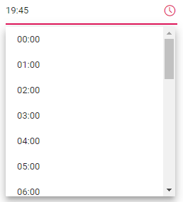
The below code demonstrates how to render TimePicker component in 24 hours Format with 60 minutes interval. The time interval is set to 60 minutes by using the Step property.
@using Syncfusion.Blazor.Calendars

<SfTimePicker TValue="DateTime?" Value="@TimeValue" Step=60 Format="HH:mm"></SfTimePicker>

@code {
    public DateTime TimeValue { get; set; } = DateTime.Now;
}
See also
- Getting Started with Syncfusion® Blazor Web Assembly App in Visual Studio or .NET CLI
- Getting Started with Syncfusion® Blazor Web App in Visual Studio or .NET CLI
NOTE
You can also explore our Blazor TimePicker Example that shows you how to render and configure the TimePicker.