How can I help you?
Adaptive Layout in Blazor Charts Component
18 Jun 20266 minutes to read
Adaptive layout in Blazor Charts ensures optimal display of chart elements on mobile devices and screens with limited space. By enabling the EnableAdaptiveRendering property, the chart automatically adjusts to container size changes, maintaining clear alignment and visibility for elements such as legend, axis titles, axis labels, data labels, chart title, and more.
@using Syncfusion.Blazor
@using Syncfusion.Blazor.Charts
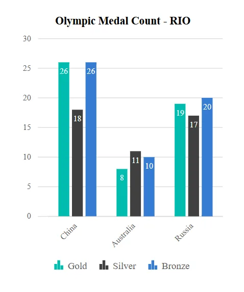
<SfChart Title="Olympic Medal Count - RIO" SubTitle="Gold, Silver, and Bronze Tallies" Width="300px" Height="400px" EnableAdaptiveRendering="true">
<ChartArea>
<ChartAreaBorder Width="0"></ChartAreaBorder>
</ChartArea>
<ChartPrimaryXAxis ValueType="Syncfusion.Blazor.Charts.ValueType.Category" PlotOffsetLeft="15">
<ChartAxisMajorGridLines Width="0"></ChartAxisMajorGridLines>
<ChartAxisMajorTickLines Width="0"></ChartAxisMajorTickLines>
</ChartPrimaryXAxis>
<ChartPrimaryYAxis Title="Medal Count">
<ChartAxisLineStyle Width="0"></ChartAxisLineStyle>
<ChartAxisMajorTickLines Width="0"></ChartAxisMajorTickLines>
</ChartPrimaryYAxis>
<ChartSeriesCollection>
<ChartSeries DataSource="@ChartPoints" XName="Country" YName="GoldMedal" Type="ChartSeriesType.Column" Name="Gold" ColumnSpacing="0.2">
<ChartSeriesAnimation Enable="false"></ChartSeriesAnimation>
<ChartMarker>
<ChartDataLabel Visible="true" Position="Syncfusion.Blazor.Charts.LabelPosition.Top">
<ChartDataLabelFont Color="#FFFFFF"></ChartDataLabelFont>
</ChartDataLabel>
</ChartMarker>
</ChartSeries>
<ChartSeries DataSource="@ChartPoints" XName="Country" YName="SilverMedal" Type="ChartSeriesType.Column" Name="Silver" ColumnSpacing="0.2">
<ChartSeriesAnimation Enable="false"></ChartSeriesAnimation>
<ChartMarker>
<ChartDataLabel Visible="true" Position="Syncfusion.Blazor.Charts.LabelPosition.Top">
<ChartDataLabelFont Color="#FFFFFF"></ChartDataLabelFont>
</ChartDataLabel>
</ChartMarker>
</ChartSeries>
<ChartSeries DataSource="@ChartPoints" XName="Country" YName="BronzeMedal" Type="ChartSeriesType.Column" Name="Bronze" ColumnSpacing="0.2">
<ChartSeriesAnimation Enable="false"></ChartSeriesAnimation>
<ChartMarker>
<ChartDataLabel Visible="true" Position="Syncfusion.Blazor.Charts.LabelPosition.Top">
<ChartDataLabelFont Color="#FFFFFF"></ChartDataLabelFont>
</ChartDataLabel>
</ChartMarker>
</ChartSeries>
</ChartSeriesCollection>
<ChartLegendSettings Visible="true" Position="LegendPosition.Right"></ChartLegendSettings>
<ChartTooltipSettings Enable="true"></ChartTooltipSettings>
</SfChart>
@code {
public List<ChartData> ChartPoints { get; set; } = new List<ChartData>
{
new ChartData { Country = "China", GoldMedal = 26, SilverMedal = 18, BronzeMedal = 26 },
new ChartData { Country = "Australia", GoldMedal = 8, SilverMedal = 11, BronzeMedal = 10 },
new ChartData { Country = "Russia", GoldMedal = 19, SilverMedal = 17, BronzeMedal = 20 }
};
public class ChartData
{
public string Country { get; set; }
public double GoldMedal { get; set; }
public double SilverMedal { get; set; }
public double BronzeMedal { get; set; }
}
}
The table below outlines the behavior of chart elements based on chart height and width:
| Element | Size | Behavior |
|---|---|---|
| Chart Title | Height < 200 / Width < 200 | Chart title is disabled |
| Chart Subtitle | Height < 300 / Width < 300 | Chart subtitle is disabled |
| Axes | Height <= 200 / Width <= 200 | Axis titles and scrollbars are disabled |
| Axes Label |
Height < 100 / Width < 100 Height < 200 / Width < 200 Height <= 400 / Width <= 400 |
Axis labels are disabled Axis labels move inside the chart Axis numeric labels are formatted with M, K, and B |
| Legend | Height < 300 / Width < 300 | Bottom/top legend moves to right if width > 200px; otherwise, disabled. Right/left legend moves to bottom if height > 200px; otherwise, disabled |
| Marker | Height < 200 / Width < 200 | Marker is disabled |
| Zoom Toolkit | Height < 200 / Width < 200 | Zoom toolkit is disabled |
| Datalabel (Column and Bar Chart Types) |
Datalabel rotates based on rectangle size; hidden if it exceeds available size |
NOTE
Refer to the Blazor Charts feature tour page for its groundbreaking feature representations and also explore the Blazor Chart Example to know various chart types and how to represent time-dependent data, showing trends at equal intervals.