Column Chart in Blazor Charts Component
18 Jun 202624 minutes to read
Column
Column Chart is the most common chart type that is used to compare Frequency, Count, Total, or Average of data in different categories. It is ideal for showing variations in the value of an item over time.
A detailed demonstration of the process for creating a column chart using Blazor Charts is presented in the video below.
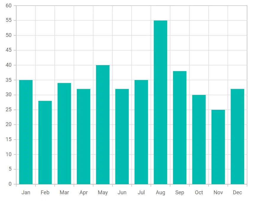
To render a Column Chart series in your chart, define the series Type as Column in your chart configuration. This indicates that the data should be represented as a column chart, which is ideal for visualizing for comparing different categories of data or tracking changes over time.
@using Syncfusion.Blazor.Charts

<SfChart>
    <ChartPrimaryXAxis ValueType="Syncfusion.Blazor.Charts.ValueType.Category"></ChartPrimaryXAxis>
    <ChartSeriesCollection>
        <ChartSeries DataSource="@SalesDetails" XName="X" YName="Y" Type="ChartSeriesType.Column">
        </ChartSeries>
    </ChartSeriesCollection>
</SfChart>

@code{
    public class ChartData
    {
        public string X { get; set;}
        public double Y {get; set;}
    }

    public List<ChartData> SalesDetails = new List<ChartData>
	{
        new ChartData { X= "Jan", Y= 35 },
        new ChartData { X= "Feb", Y= 28 },
        new ChartData { X= "Mar", Y= 34 },
        new ChartData { X= "Apr", Y= 32 },
        new ChartData { X= "May", Y= 40 },
        new ChartData { X= "Jun", Y= 32 },
        new ChartData { X= "Jul", Y= 35 },
        new ChartData { X= "Aug", Y= 55 },
        new ChartData { X= "Sep", Y= 38 },
        new ChartData { X= "Oct", Y= 30 },
        new ChartData { X= "Nov", Y= 25 },
        new ChartData { X= "Dec", Y= 32 }
    };
}
NOTE
Refer to our Blazor Column Charts feature tour page to know about its other groundbreaking feature representations. Explore our Blazor Column Charts Example to compare Frequency, Count, Total, or Average of data in different categories.
Binding data with series
You can bind data to the chart using the DataSource property within the series configuration. The DataSource value can be set using either SfDataManager property values or a list of business objects. More information on data binding can be found here. To display the data correctly, map the fields from the data to the chart series’ XName and YName properties.
@using Syncfusion.Blazor.Charts

<SfChart>
    <ChartPrimaryXAxis ValueType="Syncfusion.Blazor.Charts.ValueType.Category"></ChartPrimaryXAxis>
    <ChartSeriesCollection>
        <ChartSeries DataSource="@SalesDetails" XName="X" YName="Y" Type="ChartSeriesType.Column">
        </ChartSeries>
    </ChartSeriesCollection>
</SfChart>

@code{
    public class ChartData
    {
        public string X { get; set;}
        public double Y {get; set;}
    }

    public List<ChartData> SalesDetails = new List<ChartData>
	{
        new ChartData { X= "Jan", Y= 35 },
        new ChartData { X= "Feb", Y= 28 },
        new ChartData { X= "Mar", Y= 34 },
        new ChartData { X= "Apr", Y= 32 },
        new ChartData { X= "May", Y= 40 },
        new ChartData { X= "Jun", Y= 32 },
        new ChartData { X= "Jul", Y= 35 },
        new ChartData { X= "Aug", Y= 55 },
        new ChartData { X= "Sep", Y= 38 },
        new ChartData { X= "Oct", Y= 30 },
        new ChartData { X= "Nov", Y= 25 },
        new ChartData { X= "Dec", Y= 32 }
    };
}Series customization
The following properties can be used to customize the Column series.
Fill
The Fill property determines the color applied to the series.
@using Syncfusion.Blazor.Charts

<SfChart>
    <ChartPrimaryXAxis ValueType="Syncfusion.Blazor.Charts.ValueType.Category"></ChartPrimaryXAxis>
    <ChartSeriesCollection>
        <ChartSeries DataSource="@SalesDetails" Fill="blue" XName="X" YName="Y" Type="ChartSeriesType.Column">
        </ChartSeries>
    </ChartSeriesCollection>
</SfChart>

@code{
    public class ChartData
    {
        public string X { get; set;}
        public double Y {get; set;}
    }

    public List<ChartData> SalesDetails = new List<ChartData>
	{
        new ChartData { X= "Jan", Y= 35 },
        new ChartData { X= "Feb", Y= 28 },
        new ChartData { X= "Mar", Y= 34 },
        new ChartData { X= "Apr", Y= 32 },
        new ChartData { X= "May", Y= 40 },
        new ChartData { X= "Jun", Y= 32 },
        new ChartData { X= "Jul", Y= 35 },
        new ChartData { X= "Aug", Y= 55 },
        new ChartData { X= "Sep", Y= 38 },
        new ChartData { X= "Oct", Y= 30 },
        new ChartData { X= "Nov", Y= 25 },
        new ChartData { X= "Dec", Y= 32 }
    };
}The Fill property can be used to apply a gradient color to the column series. By configuring this property with gradient values, you can create a visually appealing effect in which the color transitions smoothly from one shade to another.
@using Syncfusion.Blazor.Charts

<SfChart>
    <ChartPrimaryXAxis ValueType="Syncfusion.Blazor.Charts.ValueType.Category"></ChartPrimaryXAxis>
    <ChartSeriesCollection>
        <ChartSeries DataSource="@SalesDetails" Fill="url(#grad1)" XName="X" YName="Y" Type="ChartSeriesType.Column">
        </ChartSeries>
    </ChartSeriesCollection>
</SfChart>

<svg style="height: 0">
   <defs>
       <linearGradient id="grad1" x1="0%" y1="0%" x2="0%" y2="100%">
           <stop offset="20%" style="stop-color:orange;stop-opacity:1" />
           <stop offset="100%" style="stop-color:black;stop-opacity:1" />
       </linearGradient>
   </defs>
</svg>

@code{
    public class ChartData
    {
        public string X { get; set;}
        public double Y {get; set;}
    }

    public List<ChartData> SalesDetails = new List<ChartData>
	{
        new ChartData { X= "Jan", Y= 35 },
        new ChartData { X= "Feb", Y= 28 },
        new ChartData { X= "Mar", Y= 34 },
        new ChartData { X= "Apr", Y= 32 },
        new ChartData { X= "May", Y= 40 },
        new ChartData { X= "Jun", Y= 32 },
        new ChartData { X= "Jul", Y= 35 },
        new ChartData { X= "Aug", Y= 55 },
        new ChartData { X= "Sep", Y= 38 },
        new ChartData { X= "Oct", Y= 30 },
        new ChartData { X= "Nov", Y= 25 },
        new ChartData { X= "Dec", Y= 32 }
    };
}Opacity
The Opacity property specifies the transparency level of the Fill. Adjusting this property allows you to control how opaque or transparent the fill color of the series appears.
@using Syncfusion.Blazor.Charts

<SfChart>
    <ChartPrimaryXAxis ValueType="Syncfusion.Blazor.Charts.ValueType.Category"></ChartPrimaryXAxis>
    <ChartSeriesCollection>
        <ChartSeries DataSource="@SalesDetails" Opacity="0.5" XName="X" YName="Y" Type="ChartSeriesType.Column">
        </ChartSeries>
    </ChartSeriesCollection>
</SfChart>

@code{
    public class ChartData
    {
        public string X { get; set;}
        public double Y {get; set;}
    }

    public List<ChartData> SalesDetails = new List<ChartData>
	{
        new ChartData { X= "Jan", Y= 35 },
        new ChartData { X= "Feb", Y= 28 },
        new ChartData { X= "Mar", Y= 34 },
        new ChartData { X= "Apr", Y= 32 },
        new ChartData { X= "May", Y= 40 },
        new ChartData { X= "Jun", Y= 32 },
        new ChartData { X= "Jul", Y= 35 },
        new ChartData { X= "Aug", Y= 55 },
        new ChartData { X= "Sep", Y= 38 },
        new ChartData { X= "Oct", Y= 30 },
        new ChartData { X= "Nov", Y= 25 },
        new ChartData { X= "Dec", Y= 32 }
    };
}DashArray
The DashArray property determines the pattern of dashes and gaps in the series border.
@using Syncfusion.Blazor.Charts

<SfChart>
    <ChartPrimaryXAxis ValueType="Syncfusion.Blazor.Charts.ValueType.Category"></ChartPrimaryXAxis>
    <ChartSeriesCollection>
        <ChartSeries DataSource="@SalesDetails" DashArray="5,5" XName="X" YName="Y" Type="Syncfusion.Blazor.Charts.ChartSeriesType.Column">
            <ChartSeriesBorder Width="2" Color="red"></ChartSeriesBorder>
        </ChartSeries>
    </ChartSeriesCollection>
</SfChart>

@code {
    public class ChartData
    {
        public string X { get; set; }
        public double Y { get; set; }
    }

    public List<ChartData> SalesDetails = new List<ChartData>
    {
        new ChartData { X= "Jan", Y= 35 },
        new ChartData { X= "Feb", Y= 28 },
        new ChartData { X= "Mar", Y= 34 },
        new ChartData { X= "Apr", Y= 32 },
        new ChartData { X= "May", Y= 40 },
        new ChartData { X= "Jun", Y= 32 },
        new ChartData { X= "Jul", Y= 35 },
        new ChartData { X= "Aug", Y= 55 },
        new ChartData { X= "Sep", Y= 38 },
        new ChartData { X= "Oct", Y= 30 },
        new ChartData { X= "Nov", Y= 25 },
        new ChartData { X= "Dec", Y= 32 }
    };
}Series Border
The ChartSeriesBorder property to customize the Width and Color of the series border.
@using Syncfusion.Blazor.Charts

<SfChart>
    <ChartPrimaryXAxis ValueType="Syncfusion.Blazor.Charts.ValueType.Category" />

    <ChartSeriesCollection>
        <ChartSeries DataSource="@SalesDetails" XName="X" YName="Y" Type="Syncfusion.Blazor.Charts.ChartSeriesType.Column" Opacity="0.5"
                     DashArray="5,5" Fill="blue">
            <ChartSeriesBorder Width="2" Color="red"></ChartSeriesBorder>
        </ChartSeries>
    </ChartSeriesCollection>
</SfChart>

@code {
    public class ChartData
    {
        public string X { get; set; }
        public double Y { get; set; }
    }

    public List<ChartData> SalesDetails = new List<ChartData>
    {
        new ChartData { X= "Jan", Y= 35 },
        new ChartData { X= "Feb", Y= 28 },
        new ChartData { X= "Mar", Y= 34 },
        new ChartData { X= "Apr", Y= 32 },
        new ChartData { X= "May", Y= 40 },
        new ChartData { X= "Jun", Y= 32 },
        new ChartData { X= "Jul", Y= 35 },
        new ChartData { X= "Aug", Y= 55 },
        new ChartData { X= "Sep", Y= 38 },
        new ChartData { X= "Oct", Y= 30 },
        new ChartData { X= "Nov", Y= 25 },
        new ChartData { X= "Dec", Y= 32 }
    };
}Corner radius
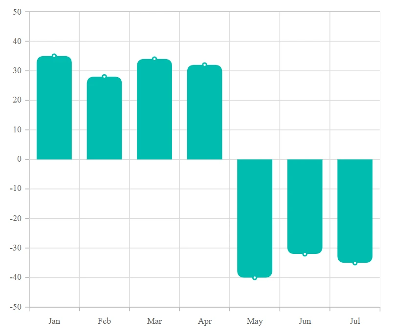
The ChartCornerRadius property is used to customize the corner radius for column series. This allows you to create columns with rounded corners, giving your chart a more polished appearance. You can customize each corner of the columns using the BottomLeft, BottomRight, TopLeft, TopRight properties.
@using Syncfusion.Blazor.Charts
<SfChart>
    <ChartPrimaryXAxis ValueType="Syncfusion.Blazor.Charts.ValueType.Category"></ChartPrimaryXAxis>
    <ChartSeriesCollection>
        <ChartSeries DataSource="@Sales" XName="Month" YName="Income" Type="Syncfusion.Blazor.Charts.ChartSeriesType.Column">
            <ChartMarker Visible="true">
            </ChartMarker>
            <ChartCornerRadius TopLeft="10" TopRight="10"></ChartCornerRadius>
        </ChartSeries>
    </ChartSeriesCollection>
</SfChart>
@code {
    public class SalesInfo
    {
        public string Month { get; set; }
        public double Income { get; set; }
    }
    public List<SalesInfo> Sales = new List<SalesInfo>
    {
        new SalesInfo { Month = "Jan", Income = 35 },
        new SalesInfo { Month = "Feb", Income = 28 },
        new SalesInfo { Month = "Mar", Income = 34 },
        new SalesInfo { Month = "Apr", Income = 32 },
        new SalesInfo { Month = "May", Income = -40 },
        new SalesInfo { Month = "Jun", Income = -32 },
        new SalesInfo { Month = "Jul", Income = -35 }
    };
}
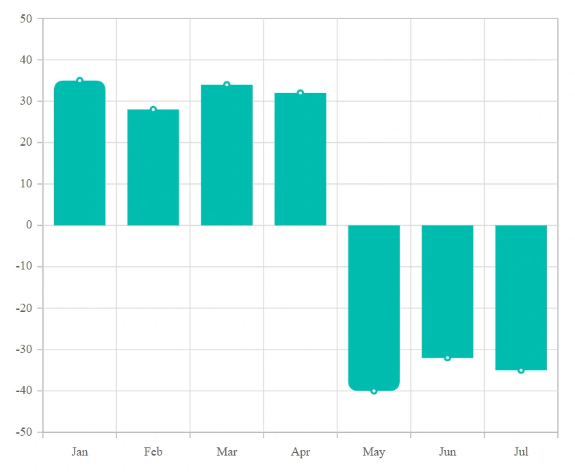
Customize the corner radius for individual points in the chart series using the OnPointRender event by utilizing the CornerRadius property in its event argument.
@using Syncfusion.Blazor.Charts

<SfChart>
    <ChartEvents OnPointRender="PointRenderEvent"></ChartEvents>

    <ChartPrimaryXAxis ValueType="Syncfusion.Blazor.Charts.ValueType.Category"></ChartPrimaryXAxis>

    <ChartSeriesCollection>
        <ChartSeries DataSource="@Sales" XName="Month" YName="Income" Type="Syncfusion.Blazor.Charts.ChartSeriesType.Column">
            <ChartMarker Visible="true">
            </ChartMarker>
        </ChartSeries>
    </ChartSeriesCollection>
</SfChart>

@code {
    public class SalesInfo
    {
        public string Month { get; set; }
        public double Income { get; set; }
    }

    public List<SalesInfo> Sales = new List<SalesInfo>
    {
        new SalesInfo { Month = "Jan", Income = 35 },
        new SalesInfo { Month = "Feb", Income = 28 },
        new SalesInfo { Month = "Mar", Income = 34 },
        new SalesInfo { Month = "Apr", Income = 32 },
        new SalesInfo { Month = "May", Income = -40 },
        new SalesInfo { Month = "Jun", Income = -32 },
        new SalesInfo { Month = "Jul", Income = -35 }
    };

    public void PointRenderEvent(PointRenderEventArgs args)
    {
        if ((args.Point.X as string) == "Jan" || (args.Point.X as string) == "May")
        {
            args.CornerRadius.TopLeft = 10;
            args.CornerRadius.TopRight = 10;
        }
    }
}
Column space and width
Column space
The ColumnSpacing property in the series to adjust the space between columns. The default value of ColumnSpacing is 0, and its range is from 0 to 1.
@using Syncfusion.Blazor.Charts

<SfChart>
    <ChartPrimaryXAxis ValueType="Syncfusion.Blazor.Charts.ValueType.Category" />

    <ChartSeriesCollection>
        <ChartSeries DataSource="@SalesDetails" XName="X" YName="Y" Type="Syncfusion.Blazor.Charts.ChartSeriesType.Column" ColumnSpacing="0.2">
        </ChartSeries>
    </ChartSeriesCollection>
</SfChart>

@code {
    public class ChartData
    {
        public string X { get; set; }
        public double Y { get; set; }
    }

    public List<ChartData> SalesDetails = new List<ChartData>
    {
        new ChartData { X= "Jan", Y= 35 },
        new ChartData { X= "Feb", Y= 28 },
        new ChartData { X= "Mar", Y= 34 },
        new ChartData { X= "Apr", Y= 32 },
        new ChartData { X= "May", Y= 40 },
        new ChartData { X= "Jun", Y= 32 },
        new ChartData { X= "Jul", Y= 35 },
        new ChartData { X= "Aug", Y= 55 },
        new ChartData { X= "Sep", Y= 38 },
        new ChartData { X= "Oct", Y= 30 },
        new ChartData { X= "Nov", Y= 25 },
        new ChartData { X= "Dec", Y= 32 }
    };
}Column width
ColumnWidth property in the series to adjust the width of the columns. The default value of ColumnWidth is 0.7, and its range is from 0 to 1.
@using Syncfusion.Blazor.Charts

<SfChart>
    <ChartPrimaryXAxis ValueType="Syncfusion.Blazor.Charts.ValueType.Category" />

    <ChartSeriesCollection>
        <ChartSeries DataSource="@SalesDetails" XName="X" YName="Y" Type="Syncfusion.Blazor.Charts.ChartSeriesType.Column" ColumnSpacing="0.2" ColumnWidth="0.2">
        </ChartSeries>
    </ChartSeriesCollection>
</SfChart>

@code {
    public class ChartData
    {
        public string X { get; set; }
        public double Y { get; set; }
    }

    public List<ChartData> SalesDetails = new List<ChartData>
    {
        new ChartData { X= "Jan", Y= 35 },
        new ChartData { X= "Feb", Y= 28 },
        new ChartData { X= "Mar", Y= 34 },
        new ChartData { X= "Apr", Y= 32 },
        new ChartData { X= "May", Y= 40 },
        new ChartData { X= "Jun", Y= 32 },
        new ChartData { X= "Jul", Y= 35 },
        new ChartData { X= "Aug", Y= 55 },
        new ChartData { X= "Sep", Y= 38 },
        new ChartData { X= "Oct", Y= 30 },
        new ChartData { X= "Nov", Y= 25 },
        new ChartData { X= "Dec", Y= 32 }
    };
}Column width in pixel
The ColumnWidthInPixel property in ChartSeries is used to set the width of the column and rectangle-based series types in pixels. This property ensures that each column maintains the specified width, providing a uniform appearance throughout the chart.
@using Syncfusion.Blazor.Charts

<SfChart>
    <ChartPrimaryXAxis ValueType="Syncfusion.Blazor.Charts.ValueType.Category" />

    <ChartSeriesCollection>
        <ChartSeries DataSource="@SalesDetails" XName="X" YName="Y" Type="Syncfusion.Blazor.Charts.ChartSeriesType.Column" ColumnSpacing="0.2" ColumnWidthInPixel="50">
        </ChartSeries>
    </ChartSeriesCollection>
</SfChart>

@code {
    public class ChartData
    {
        public string X { get; set; }
        public double Y { get; set; }
    }

    public List<ChartData> SalesDetails = new List<ChartData>
    {
        new ChartData { X= "Jan", Y= 35 },
        new ChartData { X= "Feb", Y= 28 },
        new ChartData { X= "Mar", Y= 34 },
        new ChartData { X= "Apr", Y= 32 },
        new ChartData { X= "May", Y= 40 },
        new ChartData { X= "Jun", Y= 32 },
        new ChartData { X= "Jul", Y= 35 },
        new ChartData { X= "Aug", Y= 55 },
        new ChartData { X= "Sep", Y= 38 },
        new ChartData { X= "Oct", Y= 30 },
        new ChartData { X= "Nov", Y= 25 },
        new ChartData { X= "Dec", Y= 32 }
    };
}Grouped column
Group series using GroupName so series with the same group name render together.
@using Syncfusion.Blazor.Charts

<SfChart>
        <ChartPrimaryXAxis ValueType="@Syncfusion.Blazor.Charts.ValueType.Category">
        </ChartPrimaryXAxis>
        <ChartSeriesCollection>
            <ChartSeries DataSource="@ChartPoints" XName="Year" YName="USA_Total" GroupName="USA" ColumnWidth="0.7" ColumnSpacing="0.1" Type="ChartSeriesType.Column">
            </ChartSeries>
            <ChartSeries DataSource="@ChartPoints" XName="Year" YName="USA_Gold" GroupName="USA" ColumnWidth="0.5" ColumnSpacing="0.1" Type="ChartSeriesType.Column">
             </ChartSeries>
            <ChartSeries DataSource="@ChartPoints" XName="Year" YName="UK_Total" GroupName="UK" ColumnWidth="0.7" ColumnSpacing="0.1" Type="ChartSeriesType.Column">
            </ChartSeries>
            <ChartSeries DataSource="@ChartPoints" XName="Year" YName="UK_Gold" GroupName="UK" ColumnWidth="0.5" ColumnSpacing="0.1" Type="ChartSeriesType.Column">
            </ChartSeries>
        </ChartSeriesCollection>
    </SfChart>

@code{
    public class ColumnData
    {
        public string Year { get; set; }
        public double USA_Total { get; set; }
        public double USA_Gold { get; set; }
        public double UK_Total { get; set; }
        public double UK_Gold { get; set; }
        public double China_Total { get; set; }
        public double China_Gold { get; set; }
    }
    public List<ColumnData> ChartPoints { get; set; } = new List<ColumnData>
    {
        new ColumnData { Year = "2012", USA_Total = 104, USA_Gold = 46, UK_Total = 65, UK_Gold = 29, China_Total = 91, China_Gold = 38},
        new ColumnData { Year = "2016", USA_Total = 121, USA_Gold = 46, UK_Total = 67, UK_Gold = 27, China_Total = 70, China_Gold = 26},
        new ColumnData { Year = "2020", USA_Total = 113, USA_Gold = 39, UK_Total = 65, UK_Gold = 22, China_Total = 88, China_Gold = 38},
    };
}Empty points
Data points with null, double.NaN or undefined values are considered empty. Empty data points are ignored and not plotted on the chart.
Mode
Use the Mode property to define how empty or missing data points are handled in the series. The default mode for empty points is Gap.
@using Syncfusion.Blazor.Charts

<SfChart>
    <ChartPrimaryXAxis ValueType="Syncfusion.Blazor.Charts.ValueType.Category"></ChartPrimaryXAxis>
    <ChartSeriesCollection>
        <ChartSeries DataSource="@SalesDetails" XName="X" YName="Y" Type="ChartSeriesType.Column">
            <ChartEmptyPointSettings Mode="EmptyPointMode.Zero"></ChartEmptyPointSettings>
        </ChartSeries>
    </ChartSeriesCollection>
</SfChart>

@code{
    public class ChartData
    {
        public string X { get; set;}
        public double Y {get; set;}
    }

    public List<ChartData> SalesDetails = new List<ChartData>
	{
        new ChartData { X= "Jan", Y= 35 },
        new ChartData { X= "Feb", Y= 28 },
        new ChartData { X= "Mar", Y= 34 },
        new ChartData { X= "Apr", Y= double.NaN },
        new ChartData { X= "May", Y= 40 },
        new ChartData { X= "Jun", Y= 32 },
        new ChartData { X= "Jul", Y= 35 },
        new ChartData { X= "Aug", Y= double.NaN },
        new ChartData { X= "Sep", Y= 38 },
        new ChartData { X= "Oct", Y= 30 },
        new ChartData { X= "Nov", Y= 25 },
        new ChartData { X= "Dec", Y= 32 }
    };
}Fill
Use the Fill property to customize the fill color of empty points in the series.
@using Syncfusion.Blazor.Charts

<SfChart>
    <ChartPrimaryXAxis ValueType="Syncfusion.Blazor.Charts.ValueType.Category"></ChartPrimaryXAxis>
    <ChartSeriesCollection>
        <ChartSeries DataSource="@SalesDetails" XName="X" YName="Y" Type="Syncfusion.Blazor.Charts.ChartSeriesType.Column">
            <ChartEmptyPointSettings Fill="red" Mode="EmptyPointMode.Average" />
        </ChartSeries>
    </ChartSeriesCollection>
</SfChart>

@code{
    public class ChartData
    {
        public string X { get; set;}
        public double Y {get; set;}
    }

    public List<ChartData> SalesDetails = new List<ChartData>
	{
        new ChartData { X= "Jan", Y= 35 },
        new ChartData { X= "Feb", Y= 28 },
        new ChartData { X= "Mar", Y= 34 },
        new ChartData { X= "Apr", Y= double.NaN },
        new ChartData { X= "May", Y= 40 },
        new ChartData { X= "Jun", Y= 32 },
        new ChartData { X= "Jul", Y= 35 },
        new ChartData { X= "Aug", Y= double.NaN },
        new ChartData { X= "Sep", Y= 38 },
        new ChartData { X= "Oct", Y= 30 },
        new ChartData { X= "Nov", Y= 25 },
        new ChartData { X= "Dec", Y= 32 }
    };
}Border
Use the Border property to customize the Width and Color of the border for empty points.
@using Syncfusion.Blazor.Charts

<SfChart>
    <ChartPrimaryXAxis ValueType="Syncfusion.Blazor.Charts.ValueType.Category"></ChartPrimaryXAxis>
    <ChartSeriesCollection>
        <ChartSeries DataSource="@SalesDetails" XName="X" YName="Y" Type="Syncfusion.Blazor.Charts.ChartSeriesType.Column">
            <ChartEmptyPointSettings Fill="red" Mode="EmptyPointMode.Average">
                <ChartEmptyPointBorder Color="green" Width="2"></ChartEmptyPointBorder>
            </ChartEmptyPointSettings>
        </ChartSeries>
    </ChartSeriesCollection>
</SfChart>

@code {
    public class ChartData
    {
        public string X { get; set; }
        public double Y { get; set; }
    }

    public List<ChartData> SalesDetails = new List<ChartData>
    {
        new ChartData { X= "Jan", Y= 35 },
        new ChartData { X= "Feb", Y= 28 },
        new ChartData { X= "Mar", Y= 34 },
        new ChartData { X= "Apr", Y= double.NaN },
        new ChartData { X= "May", Y= 40 },
        new ChartData { X= "Jun", Y= 32 },
        new ChartData { X= "Jul", Y= 35 },
        new ChartData { X= "Aug", Y= double.NaN },
        new ChartData { X= "Sep", Y= 38 },
        new ChartData { X= "Oct", Y= 30 },
        new ChartData { X= "Nov", Y= 25 },
        new ChartData { X= "Dec", Y= 32 }
    };
}Events
Series render
The OnSeriesRender event allows you to customize series properties, such as Data, Fill, and Series, before they are rendered on the chart.
@using Syncfusion.Blazor.Charts

<SfChart>
    <ChartPrimaryXAxis ValueType="Syncfusion.Blazor.Charts.ValueType.Category"></ChartPrimaryXAxis>
    <ChartEvents OnSeriesRender="SeriesRender"></ChartEvents>
    <ChartSeriesCollection>
        <ChartSeries DataSource="@SalesDetails" XName="X" YName="Y" Type="ChartSeriesType.Column">
        </ChartSeries>
    </ChartSeriesCollection>
</SfChart>

@code{
    public class ChartData
    {
        public string X { get; set;}
        public double Y {get; set;}
    }

    public void SeriesRender(SeriesRenderEventArgs args)
    {
        args.Fill = "#FF4081";
    }

    public List<ChartData> SalesDetails = new List<ChartData>
	{
        new ChartData { X= "Jan", Y= 35 },
        new ChartData { X= "Feb", Y= 28 },
        new ChartData { X= "Mar", Y= 34 },
        new ChartData { X= "Apr", Y= 32 },
        new ChartData { X= "May", Y= 40 },
        new ChartData { X= "Jun", Y= 32 },
        new ChartData { X= "Jul", Y= 35 },
        new ChartData { X= "Aug", Y= 55 },
        new ChartData { X= "Sep", Y= 38 },
        new ChartData { X= "Oct", Y= 30 },
        new ChartData { X= "Nov", Y= 25 },
        new ChartData { X= "Dec", Y= 32 }
    };
}Point render
The OnPointRender event allows you to customize each data point before it is rendered on the chart.
@using Syncfusion.Blazor.Charts

<SfChart>
    <ChartPrimaryXAxis ValueType="Syncfusion.Blazor.Charts.ValueType.Category"></ChartPrimaryXAxis>
   <ChartEvents OnPointRender="PointRender"></ChartEvents>
    <ChartSeriesCollection>
        <ChartSeries DataSource="@SalesDetails" XName="X" YName="Y" Type="Syncfusion.Blazor.Charts.ChartSeriesType.Column">
        </ChartSeries>
    </ChartSeriesCollection>
</SfChart>

@code{
    public class ChartData
    {
        public string X { get; set;}
        public double Y {get; set;}
    }

    public void PointRender(PointRenderEventArgs args)
    {
        args.Fill = (args.Point.Index % 2 != 0) ? "#ff6347" : "#009cb8";
    }

    public List<ChartData> SalesDetails = new List<ChartData>
	{
        new ChartData { X= "Jan", Y= 35 },
        new ChartData { X= "Feb", Y= 28 },
        new ChartData { X= "Mar", Y= 34 },
        new ChartData { X= "Apr", Y= 32 },
        new ChartData { X= "May", Y= 40 },
        new ChartData { X= "Jun", Y= 32 },
        new ChartData { X= "Jul", Y= 35 },
        new ChartData { X= "Aug", Y= 55 },
        new ChartData { X= "Sep", Y= 38 },
        new ChartData { X= "Oct", Y= 30 },
        new ChartData { X= "Nov", Y= 25 },
        new ChartData { X= "Dec", Y= 32 }
    };
}NOTE
Refer to the Blazor Charts feature tour page for its groundbreaking feature representations and also explore the Blazor Chart Example to know various chart types and how to represent time-dependent data, showing trends at equal intervals.