Range Column in Blazor Charts Component
18 Jun 202624 minutes to read
Range Column
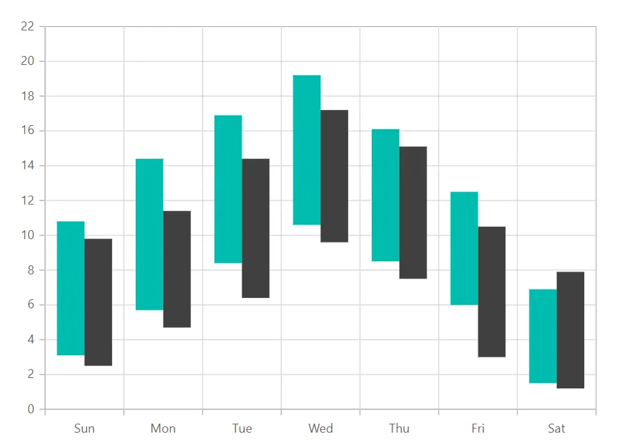
Range Column Chart shows variation in the data values for a given time using vertical bars. To render a range column series in your chart, you need to follow a few steps to configure it correctly. Here’s a concise guide on how to do this:
-
Set the series type: Define the series
TypeasRangeColumnin your chart configuration. This indicates that the data should be represented as a range column chart, which is ideal for visualizing data that has both minimum and maximum values for each category. This is especially useful for visualizing data ranges, such as temperature fluctuations over time, stock prices, or any other data with upper and lower bounds. -
Provide high and low values: The
RangeColumnseries requires two y-values for each data point, you need to specify both the high and low values. The high value represents the maximum range, while the low value represents the minimum range for each data point. These values define the upper and lower boundaries of the column for each point on the chart.
@using Syncfusion.Blazor.Charts

<SfChart>
    <ChartPrimaryXAxis ValueType="Syncfusion.Blazor.Charts.ValueType.Category"></ChartPrimaryXAxis>

    <ChartSeriesCollection>
        <ChartSeries DataSource="@WeatherReport1" XName="X" High="High" Low="Low" Width="2" Type="ChartSeriesType.RangeColumn">
        </ChartSeries>
        <ChartSeries DataSource="@WeatherReport2" XName="X" High="High" Low="Low" Width="2" Type="ChartSeriesType.RangeColumn">
        </ChartSeries>
    </ChartSeriesCollection>
</SfChart>

@code{
    public class ChartData
    {
        public string X { get; set; }
        public double Low { get; set; }
        public double High { get; set; }
    }

    public List<ChartData> WeatherReport1 = new List<ChartData>
	{
        new ChartData { X= "Sun", Low= 3.1, High= 10.8 },
        new ChartData { X= "Mon", Low= 5.7, High= 14.4 },
        new ChartData { X= "Tue", Low= 8.4, High= 16.9 },
        new ChartData { X= "Wed", Low= 10.6, High= 19.2 },
        new ChartData { X= "Thu", Low= 8.5, High= 16.1 },
        new ChartData { X= "Fri", Low= 6.0, High= 12.5 },
        new ChartData { X= "Sat", Low= 1.5, High= 6.9 }
    };

    public List<ChartData> WeatherReport2 = new List<ChartData>
	{
        new ChartData { X= "Sun", Low= 2.5, High= 9.8 },
        new ChartData { X= "Mon", Low= 4.7, High= 11.4 },
        new ChartData { X= "Tue", Low= 6.4, High= 14.4 },
        new ChartData { X= "Wed", Low= 9.6, High= 17.2 },
        new ChartData { X= "Thu", Low= 7.5, High= 15.1 },
        new ChartData { X= "Fri", Low= 3.0, High= 10.5 },
        new ChartData { X= "Sat", Low= 1.2, High= 7.9 }
    };
}
NOTE
Refer to the Blazor Range Column Chart feature tour page to know about its other groundbreaking feature representations. Explore the Blazor Range Column Chart Example to know how to show variations in the data values for a given time.
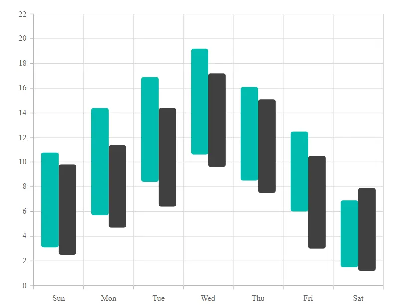
Binding data with series
You can bind data to the chart using the DataSource property within the series configuration. The DataSource value can be set using either SfDataManager property values or a list of business objects. More information on data binding can be found here. To display the data correctly, map the fields from the data to the chart series’ XName, High and Low properties.
@using Syncfusion.Blazor.Charts

<SfChart>
    <ChartPrimaryXAxis ValueType="Syncfusion.Blazor.Charts.ValueType.Category"></ChartPrimaryXAxis>

    <ChartSeriesCollection>
        <ChartSeries DataSource="@WeatherReport1" XName="X" High="High" Low="Low" Width="2" Type="ChartSeriesType.RangeColumn">
        </ChartSeries>
        <ChartSeries DataSource="@WeatherReport2" XName="X" High="High" Low="Low" Width="2" Type="ChartSeriesType.RangeColumn">
        </ChartSeries>
    </ChartSeriesCollection>
</SfChart>

@code{
    public class ChartData
    {
        public string X { get; set; }
        public double Low { get; set; }
        public double High { get; set; }
    }

    public List<ChartData> WeatherReport1 = new List<ChartData>
	{
        new ChartData { X= "Sun", Low= 3.1, High= 10.8 },
        new ChartData { X= "Mon", Low= 5.7, High= 14.4 },
        new ChartData { X= "Tue", Low= 8.4, High= 16.9 },
        new ChartData { X= "Wed", Low= 10.6, High= 19.2 },
        new ChartData { X= "Thu", Low= 8.5, High= 16.1 },
        new ChartData { X= "Fri", Low= 6.0, High= 12.5 },
        new ChartData { X= "Sat", Low= 1.5, High= 6.9 }
    };

    public List<ChartData> WeatherReport2 = new List<ChartData>
	{
        new ChartData { X= "Sun", Low= 2.5, High= 9.8 },
        new ChartData { X= "Mon", Low= 4.7, High= 11.4 },
        new ChartData { X= "Tue", Low= 6.4, High= 14.4 },
        new ChartData { X= "Wed", Low= 9.6, High= 17.2 },
        new ChartData { X= "Thu", Low= 7.5, High= 15.1 },
        new ChartData { X= "Fri", Low= 3.0, High= 10.5 },
        new ChartData { X= "Sat", Low= 1.2, High= 7.9 }
    };
}Series customization
The following properties can be used to customize the Range Column series.
Fill
The Fill property determines the color applied to the series.
@using Syncfusion.Blazor.Charts

<SfChart>
    <ChartPrimaryXAxis ValueType="Syncfusion.Blazor.Charts.ValueType.Category"></ChartPrimaryXAxis>

    <ChartSeriesCollection>
        <ChartSeries DataSource="@WeatherReport1" XName="X" High="High" Low="Low" Width="2" Type="Syncfusion.Blazor.Charts.ChartSeriesType.RangeColumn" Fill="green"></ChartSeries>
        <ChartSeries DataSource="@WeatherReport2" XName="X" High="High" Low="Low" Width="2" Type="Syncfusion.Blazor.Charts.ChartSeriesType.RangeColumn" Fill="red"></ChartSeries>
    </ChartSeriesCollection>
</SfChart>

@code {
    public class ChartData
    {

        public string X { get; set; }
        public double Low { get; set; }
        public double High { get; set; }
    }

    public List<ChartData> WeatherReport1 = new List<ChartData>
    {
        new  ChartData { X=  "Sun", Low=  3.1, High=  10.8 },
        new  ChartData { X=  "Mon", Low=  5.7, High=  14.4 },
        new  ChartData { X=  "Tue", Low=  8.4, High=  16.9 },
        new  ChartData { X=  "Wed", Low=  10.6, High=  19.2 },
        new  ChartData { X=  "Thu", Low=  8.5, High=  16.1 },
        new  ChartData { X=  "Fri", Low=  6.0, High=  12.5 },
        new  ChartData { X=  "Sat", Low=  1.5, High=  6.9 }
    };

    public List<ChartData> WeatherReport2 = new List<ChartData>
    {
        new  ChartData { X=  "Sun", Low=  2.5, High=  9.8 },
        new  ChartData { X=  "Mon", Low=  4.7, High=  11.4 },
        new  ChartData { X=  "Tue", Low=  6.4, High=  14.4 },
        new  ChartData { X=  "Wed", Low=  9.6, High=  17.2 },
        new  ChartData { X=  "Thu", Low=  7.5, High=  15.1 },
        new  ChartData { X=  "Fri", Low=  3.0, High=  10.5 },
        new  ChartData { X=  "Sat", Low=  1.2, High=  7.9 }
    };
}The Fill property can be used to apply a gradient color to the range column series. By configuring this property with gradient values will create a visually appealing effect in which the color transitions smoothly from one shade to another.
@using Syncfusion.Blazor.Charts

<SfChart>
    <ChartPrimaryXAxis ValueType="Syncfusion.Blazor.Charts.ValueType.Category"></ChartPrimaryXAxis>

    <ChartSeriesCollection>
        <ChartSeries DataSource="@WeatherReport1" XName="X" High="High" Low="Low" Width="2" Type="ChartSeriesType.RangeColumn" Fill="url(#grad1)"></ChartSeries>
        <ChartSeries DataSource="@WeatherReport2" XName="X" High="High" Low="Low" Width="2" Type="ChartSeriesType.RangeColumn" Fill="url(#grad2)"></ChartSeries>
    </ChartSeriesCollection>
</SfChart>

<svg style="height: 0">
    <defs>
        <linearGradient id="grad1" x1="0%" y1="0%" x2="0%" y2="100%">
            <stop offset="20%" style="stop-color:orange;stop-opacity:1" />
            <stop offset="100%" style="stop-color:black;stop-opacity:1" />
        </linearGradient>
    </defs>
</svg>

<svg style="height: 0">
    <defs>
        <linearGradient id="grad2" x1="0%" y1="0%" x2="0%" y2="100%">
            <stop offset="20%" style="stop-color:green;stop-opacity:1" />
            <stop offset="100%" style="stop-color:lawngreen;stop-opacity:1" />
        </linearGradient>
    </defs>
</svg>

@code {
    public class ChartData
    {

        public string X { get; set; }
        public double Low { get; set; }
        public double High { get; set; }
    }

    public List<ChartData> WeatherReport1 = new List<ChartData>
    {
        new  ChartData { X=  "Sun", Low=  3.1, High=  10.8 },
        new  ChartData { X=  "Mon", Low=  5.7, High=  14.4 },
        new  ChartData { X=  "Tue", Low=  8.4, High=  16.9 },
        new  ChartData { X=  "Wed", Low=  10.6, High=  19.2 },
        new  ChartData { X=  "Thu", Low=  8.5, High=  16.1 },
        new  ChartData { X=  "Fri", Low=  6.0, High=  12.5 },
        new  ChartData { X=  "Sat", Low=  1.5, High=  6.9 }
    };

    public List<ChartData> WeatherReport2 = new List<ChartData>
    {
        new  ChartData { X=  "Sun", Low=  2.5, High=  9.8 },
        new  ChartData { X=  "Mon", Low=  4.7, High=  11.4 },
        new  ChartData { X=  "Tue", Low=  6.4, High=  14.4 },
        new  ChartData { X=  "Wed", Low=  9.6, High=  17.2 },
        new  ChartData { X=  "Thu", Low=  7.5, High=  15.1 },
        new  ChartData { X=  "Fri", Low=  3.0, High=  10.5 },
        new  ChartData { X=  "Sat", Low=  1.2, High=  7.9 }
    };
}Opacity
The Opacity property specifies the transparency level of the Fill. Adjusting this property allows you to control how opaque or transparent the fill color of the series appears.
@using Syncfusion.Blazor.Charts

<SfChart>
    <ChartPrimaryXAxis ValueType="Syncfusion.Blazor.Charts.ValueType.Category"></ChartPrimaryXAxis>

    <ChartSeriesCollection>
        <ChartSeries DataSource="@WeatherReport1" XName="X" High="High" Low="Low" Width="2" Type="Syncfusion.Blazor.Charts.ChartSeriesType.RangeColumn" Fill="green" Opacity="0.5"></ChartSeries>
        <ChartSeries DataSource="@WeatherReport2" XName="X" High="High" Low="Low" Width="2" Type="Syncfusion.Blazor.Charts.ChartSeriesType.RangeColumn" Fill="red" Opacity="0.5"></ChartSeries>
    </ChartSeriesCollection>
</SfChart>

@code {
    public class ChartData
    {

        public string X { get; set; }
        public double Low { get; set; }
        public double High { get; set; }
    }

    public List<ChartData> WeatherReport1 = new List<ChartData>
    {
        new  ChartData { X=  "Sun", Low=  3.1, High=  10.8 },
        new  ChartData { X=  "Mon", Low=  5.7, High=  14.4 },
        new  ChartData { X=  "Tue", Low=  8.4, High=  16.9 },
        new  ChartData { X=  "Wed", Low=  10.6, High=  19.2 },
        new  ChartData { X=  "Thu", Low=  8.5, High=  16.1 },
        new  ChartData { X=  "Fri", Low=  6.0, High=  12.5 },
        new  ChartData { X=  "Sat", Low=  1.5, High=  6.9 }
    };

    public List<ChartData> WeatherReport2 = new List<ChartData>
    {
        new  ChartData { X=  "Sun", Low=  2.5, High=  9.8 },
        new  ChartData { X=  "Mon", Low=  4.7, High=  11.4 },
        new  ChartData { X=  "Tue", Low=  6.4, High=  14.4 },
        new  ChartData { X=  "Wed", Low=  9.6, High=  17.2 },
        new  ChartData { X=  "Thu", Low=  7.5, High=  15.1 },
        new  ChartData { X=  "Fri", Low=  3.0, High=  10.5 },
        new  ChartData { X=  "Sat", Low=  1.2, High=  7.9 }
    };
}DashArray
The DashArray property determines the pattern of dashes and gaps in the series border.
@using Syncfusion.Blazor.Charts

<SfChart>
    <ChartPrimaryXAxis ValueType="Syncfusion.Blazor.Charts.ValueType.Category"></ChartPrimaryXAxis>

    <ChartSeriesCollection>
        <ChartSeries DataSource="@WeatherReport1" XName="X" High="High" Low="Low" Width="2" Type="Syncfusion.Blazor.Charts.ChartSeriesType.RangeColumn" Fill="green" DashArray="5,5" Opacity="0.7">
            <ChartSeriesBorder Width="2" Color="green"></ChartSeriesBorder>
        </ChartSeries>
        <ChartSeries DataSource="@WeatherReport2" XName="X" High="High" Low="Low" Width="2" Type="Syncfusion.Blazor.Charts.ChartSeriesType.RangeColumn" Fill="red" DashArray="5,5" Opacity="0.7">
            <ChartSeriesBorder Width="2" Color="red"></ChartSeriesBorder>
        </ChartSeries>
    </ChartSeriesCollection>
</SfChart>

@code {
    public class ChartData
    {

        public string X { get; set; }
        public double Low { get; set; }
        public double High { get; set; }
    }

    public List<ChartData> WeatherReport1 = new List<ChartData>
    {
        new  ChartData { X=  "Sun", Low=  3.1, High=  10.8 },
        new  ChartData { X=  "Mon", Low=  5.7, High=  14.4 },
        new  ChartData { X=  "Tue", Low=  8.4, High=  16.9 },
        new  ChartData { X=  "Wed", Low=  10.6, High=  19.2 },
        new  ChartData { X=  "Thu", Low=  8.5, High=  16.1 },
        new  ChartData { X=  "Fri", Low=  6.0, High=  12.5 },
        new  ChartData { X=  "Sat", Low=  1.5, High=  6.9 }
    };

    public List<ChartData> WeatherReport2 = new List<ChartData>
    {
        new  ChartData { X=  "Sun", Low=  2.5, High=  9.8 },
        new  ChartData { X=  "Mon", Low=  4.7, High=  11.4 },
        new  ChartData { X=  "Tue", Low=  6.4, High=  14.4 },
        new  ChartData { X=  "Wed", Low=  9.6, High=  17.2 },
        new  ChartData { X=  "Thu", Low=  7.5, High=  15.1 },
        new  ChartData { X=  "Fri", Low=  3.0, High=  10.5 },
        new  ChartData { X=  "Sat", Low=  1.2, High=  7.9 }
    };
}Series Border
The ChartSeriesBorder property determines the Color and Width of series border.
@using Syncfusion.Blazor.Charts

<SfChart>
    <ChartPrimaryXAxis ValueType="Syncfusion.Blazor.Charts.ValueType.Category"></ChartPrimaryXAxis>

    <ChartSeriesCollection>
        <ChartSeries DataSource="@WeatherReport1" XName="X" High="High" Low="Low" Width="2" Type="Syncfusion.Blazor.Charts.ChartSeriesType.RangeColumn" Fill="green" DashArray="5,5" Opacity="0.7">
            <ChartSeriesBorder Width="2" Color="green"></ChartSeriesBorder>
        </ChartSeries>
        <ChartSeries DataSource="@WeatherReport2" XName="X" High="High" Low="Low" Width="2" Type="Syncfusion.Blazor.Charts.ChartSeriesType.RangeColumn" Fill="red" DashArray="5,5" Opacity="0.7">
            <ChartSeriesBorder Width="2" Color="red"></ChartSeriesBorder>
        </ChartSeries>
    </ChartSeriesCollection>
</SfChart>

@code {
    public class ChartData
    {

        public string X { get; set; }
        public double Low { get; set; }
        public double High { get; set; }
    }

    public List<ChartData> WeatherReport1 = new List<ChartData>
    {
        new  ChartData { X=  "Sun", Low=  3.1, High=  10.8 },
        new  ChartData { X=  "Mon", Low=  5.7, High=  14.4 },
        new  ChartData { X=  "Tue", Low=  8.4, High=  16.9 },
        new  ChartData { X=  "Wed", Low=  10.6, High=  19.2 },
        new  ChartData { X=  "Thu", Low=  8.5, High=  16.1 },
        new  ChartData { X=  "Fri", Low=  6.0, High=  12.5 },
        new  ChartData { X=  "Sat", Low=  1.5, High=  6.9 }
    };

    public List<ChartData> WeatherReport2 = new List<ChartData>
    {
        new  ChartData { X=  "Sun", Low=  2.5, High=  9.8 },
        new  ChartData { X=  "Mon", Low=  4.7, High=  11.4 },
        new  ChartData { X=  "Tue", Low=  6.4, High=  14.4 },
        new  ChartData { X=  "Wed", Low=  9.6, High=  17.2 },
        new  ChartData { X=  "Thu", Low=  7.5, High=  15.1 },
        new  ChartData { X=  "Fri", Low=  3.0, High=  10.5 },
        new  ChartData { X=  "Sat", Low=  1.2, High=  7.9 }
    };
}Column Spacing
The ColumnSpacing property determines the space between the series segments.
@using  Syncfusion.Blazor.Charts

<SfChart>
    <ChartPrimaryXAxis ValueType="Syncfusion.Blazor.Charts.ValueType.Category"></ChartPrimaryXAxis>

    <ChartSeriesCollection>
        <ChartSeries DataSource="@WeatherReport1" XName="X" High="High" Low="Low" Width="2" Type="ChartSeriesType.RangeColumn" Fill="green" ColumnSpacing="0.4" DashArray="5,5" Opacity="0.7">
            <ChartSeriesBorder Width="2" Color="green"></ChartSeriesBorder>
        </ChartSeries>
        <ChartSeries DataSource="@WeatherReport2" XName="X" High="High" Low="Low" Width="2" Type="ChartSeriesType.RangeColumn" Fill="red" ColumnSpacing="0.4" DashArray="5,5" Opacity="0.7">
            <ChartSeriesBorder Width="2" Color="red"></ChartSeriesBorder>
        </ChartSeries>
    </ChartSeriesCollection>
</SfChart>

@code{
    public class ChartData
    {

        public string X { get; set; }
        public double Low { get; set; }
        public double High { get; set; }
    }

    public List<ChartData> WeatherReport1 = new List<ChartData>
    {
        new  ChartData { X=  "Sun", Low=  3.1, High=  10.8 },
        new  ChartData { X=  "Mon", Low=  5.7, High=  14.4 },
        new  ChartData { X=  "Tue", Low=  8.4, High=  16.9 },
        new  ChartData { X=  "Wed", Low=  10.6, High=  19.2 },
        new  ChartData { X=  "Thu", Low=  8.5, High=  16.1 },
        new  ChartData { X=  "Fri", Low=  6.0, High=  12.5 },
        new  ChartData { X=  "Sat", Low=  1.5, High=  6.9 }
    };

    public List<ChartData> WeatherReport2 = new List<ChartData>
    {
        new  ChartData { X=  "Sun", Low=  2.5, High=  9.8 },
        new  ChartData { X=  "Mon", Low=  4.7, High=  11.4 },
        new  ChartData { X=  "Tue", Low=  6.4, High=  14.4 },
        new  ChartData { X=  "Wed", Low=  9.6, High=  17.2 },
        new  ChartData { X=  "Thu", Low=  7.5, High=  15.1 },
        new  ChartData { X=  "Fri", Low=  3.0, High=  10.5 },
        new  ChartData { X=  "Sat", Low=  1.2, High=  7.9 }
    };
}Corner radius
The ChartCornerRadius property is used to customize the corner radius for range column series. This allows you to create columns with rounded corners, giving your chart a more polished appearance. You can customize each corner of the columns using the BottomLeft, BottomRight, TopLeft, TopRight properties.
@using Syncfusion.Blazor.Charts

<SfChart>
    <ChartPrimaryXAxis ValueType="Syncfusion.Blazor.Charts.ValueType.Category"></ChartPrimaryXAxis>

    <ChartSeriesCollection>
        <ChartSeries DataSource="@Sales1" XName="X" High="High" Low="Low" Type="Syncfusion.Blazor.Charts.ChartSeriesType.RangeColumn">
            <ChartCornerRadius TopLeft="4" TopRight="4" BottomLeft="4" BottomRight="4"></ChartCornerRadius>
        </ChartSeries>
        <ChartSeries DataSource="@Sales2" XName="X" High="High" Low="Low" Type="Syncfusion.Blazor.Charts.ChartSeriesType.RangeColumn">
            <ChartCornerRadius TopLeft="4" TopRight="4" BottomLeft="4" BottomRight="4"></ChartCornerRadius>
        </ChartSeries>
    </ChartSeriesCollection>
</SfChart>

@code {
    public class SalesInfo
    {
        public string X { get; set; }
        public double Low { get; set; }
        public double High { get; set; }
    }

    public List<SalesInfo> Sales1 = new List<SalesInfo>
    {
        new SalesInfo { X= "Sun", Low= 3.1, High= 10.8 },
        new SalesInfo { X= "Mon", Low= 5.7, High= 14.4 },
        new SalesInfo { X= "Tue", Low= 8.4, High= 16.9 },
        new SalesInfo { X= "Wed", Low= 10.6, High= 19.2 },
        new SalesInfo { X= "Thu", Low= 8.5, High= 16.1 },
        new SalesInfo { X= "Fri", Low= 6.0, High= 12.5 },
        new SalesInfo { X= "Sat", Low= 1.5, High= 6.9 }
    };

    public List<SalesInfo> Sales2 = new List<SalesInfo>
    {
        new SalesInfo { X= "Sun", Low= 2.5, High= 9.8 },
        new SalesInfo { X= "Mon", Low= 4.7, High= 11.4 },
        new SalesInfo { X= "Tue", Low= 6.4, High= 14.4 },
        new SalesInfo { X= "Wed", Low= 9.6, High= 17.2 },
        new SalesInfo { X= "Thu", Low= 7.5, High= 15.1 },
        new SalesInfo { X= "Fri", Low= 3.0, High= 10.5 },
        new SalesInfo { X= "Sat", Low= 1.2, High= 7.9 }
    };
}
Customize the corner radius for individual points in the chart series using the OnPointRender event by utilizing the CornerRadius property in its event argument.
@using Syncfusion.Blazor.Charts

<SfChart>
    <ChartEvents OnPointRender="PointRenderEvent"></ChartEvents>

    <ChartPrimaryXAxis ValueType="Syncfusion.Blazor.Charts.ValueType.Category"></ChartPrimaryXAxis>

    <ChartSeriesCollection>
        <ChartSeries DataSource="@Sales1" XName="X" High="High" Low="Low" Type="Syncfusion.Blazor.Charts.ChartSeriesType.RangeColumn">
        </ChartSeries>
        <ChartSeries DataSource="@Sales2" XName="X" High="High" Low="Low" Type="Syncfusion.Blazor.Charts.ChartSeriesType.RangeColumn">
        </ChartSeries>
    </ChartSeriesCollection>    `
</SfChart>

@code {
    public class SalesInfo
    {
        public string X { get; set; }
        public double Low { get; set; }
        public double High { get; set; }
    }

    public List<SalesInfo> Sales1 = new List<SalesInfo>
    {
        new SalesInfo { X= "Sun", Low= 3.1, High= 10.8 },
        new SalesInfo { X= "Mon", Low= 5.7, High= 14.4 },
        new SalesInfo { X= "Tue", Low= 8.4, High= 16.9 },
        new SalesInfo { X= "Wed", Low= 10.6, High= 19.2 },
        new SalesInfo { X= "Thu", Low= 8.5, High= 16.1 },
        new SalesInfo { X= "Fri", Low= 6.0, High= 12.5 },
        new SalesInfo { X= "Sat", Low= 1.5, High= 6.9 }
    };

    public List<SalesInfo> Sales2 = new List<SalesInfo>
    {
        new SalesInfo { X= "Sun", Low= 2.5, High= 9.8 },
        new SalesInfo { X= "Mon", Low= 4.7, High= 11.4 },
        new SalesInfo { X= "Tue", Low= 6.4, High= 14.4 },
        new SalesInfo { X= "Wed", Low= 9.6, High= 17.2 },
        new SalesInfo { X= "Thu", Low= 7.5, High= 15.1 },
        new SalesInfo { X= "Fri", Low= 3.0, High= 10.5 },
        new SalesInfo { X= "Sat", Low= 1.2, High= -7.9 }
    };

    public void PointRenderEvent(PointRenderEventArgs args)
    {
        if ((args.Point.X as string) == "Sun" || (args.Point.X as string) == "Wed" || (args.Point.X as string) == "Sat")
        {
            args.CornerRadius.TopLeft = 5;
            args.CornerRadius.TopRight = 5;
            args.CornerRadius.BottomLeft = 5;
            args.CornerRadius.BottomRight = 5;
        }
    }
}
Empty points
Data points with null or undefined values are considered empty. Empty data points are ignored and not plotted on the chart.
Mode
Use the Mode property to define how empty or missing data points are handled in the series. The default mode for empty points is Gap.
@using Syncfusion.Blazor.Charts

<SfChart>
    <ChartPrimaryXAxis ValueType="Syncfusion.Blazor.Charts.ValueType.Category"></ChartPrimaryXAxis>

    <ChartSeriesCollection>
        <ChartSeries DataSource="@WeatherReport1" XName="X" High="High" Low="Low" Width="2" Type="Syncfusion.Blazor.Charts.ChartSeriesType.RangeColumn">
            <ChartEmptyPointSettings Mode="EmptyPointMode.Gap"></ChartEmptyPointSettings>
            <ChartMarker Visible="true" Height="10" Width="10"></ChartMarker>
        </ChartSeries>
        <ChartSeries DataSource="@WeatherReport2" XName="X" High="High" Low="Low" Width="2" Type="Syncfusion.Blazor.Charts.ChartSeriesType.RangeColumn">
            <ChartEmptyPointSettings Mode="EmptyPointMode.Gap"></ChartEmptyPointSettings>
            <ChartMarker Visible="true" Height="10" Width="10"></ChartMarker>
        </ChartSeries>
    </ChartSeriesCollection>
</SfChart>

@code {
    public class ChartData
    {

        public string X { get; set; }
        public double Low { get; set; }
        public double High { get; set; }
    }

    public List<ChartData> WeatherReport1 = new List<ChartData>
    {
        new  ChartData { X=  "Sun", Low=  3.1, High=  10.8 },
        new  ChartData { X=  "Mon", Low=  5.7, High=  14.4 },
        new  ChartData { X=  "Tue", Low=  8.4, High=  16.9 },
        new  ChartData { X=  "Wed", Low=  double.NaN, High=  double.NaN },
        new  ChartData { X=  "Thu", Low=  8.5, High=  16.1 },
        new  ChartData { X=  "Fri", Low=  6.0, High=  12.5 },
        new  ChartData { X=  "Sat", Low=  1.5, High=  6.9 }
    };

    public List<ChartData> WeatherReport2 = new List<ChartData>
    {
        new  ChartData { X=  "Sun", Low=  2.5, High=  9.8 },
        new  ChartData { X=  "Mon", Low=  4.7, High=  11.4 },
        new  ChartData { X=  "Tue", Low=  6.4, High=  14.4 },
        new  ChartData { X=  "Wed", Low=  double.NaN, High=  double.NaN },
        new  ChartData { X=  "Thu", Low=  7.5, High=  15.1 },
        new  ChartData { X=  "Fri", Low=  3.0, High=  10.5 },
        new  ChartData { X=  "Sat", Low=  1.2, High=  7.9 }
    };
}Fill
Use the Fill property to customize the fill color of empty points in the series.
@using Syncfusion.Blazor.Charts

<SfChart>
    <ChartPrimaryXAxis ValueType="Syncfusion.Blazor.Charts.ValueType.Category"></ChartPrimaryXAxis>

    <ChartSeriesCollection>
        <ChartSeries DataSource="@WeatherReport1" XName="X" High="High" Low="Low" Width="2" Type="Syncfusion.Blazor.Charts.ChartSeriesType.RangeColumn">
            <ChartEmptyPointSettings Mode="EmptyPointMode.Average" Fill="#FFDE59"></ChartEmptyPointSettings>
            <ChartMarker Visible="true" Height="10" Width="10"></ChartMarker>
        </ChartSeries>
        <ChartSeries DataSource="@WeatherReport2" XName="X" High="High" Low="Low" Width="2" Type="Syncfusion.Blazor.Charts.ChartSeriesType.RangeColumn">
            <ChartEmptyPointSettings Mode="EmptyPointMode.Average" Fill="#FFDE59"></ChartEmptyPointSettings>
            <ChartMarker Visible="true" Height="10" Width="10"></ChartMarker>
        </ChartSeries>
    </ChartSeriesCollection>
</SfChart>

@code {
    public class ChartData
    {

        public string X { get; set; }
        public double Low { get; set; }
        public double High { get; set; }
    }

    public List<ChartData> WeatherReport1 = new List<ChartData>
    {
        new  ChartData { X=  "Sun", Low=  3.1, High=  10.8 },
        new  ChartData { X=  "Mon", Low=  5.7, High=  14.4 },
        new  ChartData { X=  "Tue", Low=  8.4, High=  16.9 },
        new  ChartData { X=  "Wed", Low=  double.NaN, High=  double.NaN },
        new  ChartData { X=  "Thu", Low=  8.5, High=  16.1 },
        new  ChartData { X=  "Fri", Low=  6.0, High=  12.5 },
        new  ChartData { X=  "Sat", Low=  1.5, High=  6.9 }
    };

    public List<ChartData> WeatherReport2 = new List<ChartData>
    {
        new  ChartData { X=  "Sun", Low=  2.5, High=  9.8 },
        new  ChartData { X=  "Mon", Low=  4.7, High=  11.4 },
        new  ChartData { X=  "Tue", Low=  6.4, High=  14.4 },
        new  ChartData { X=  "Wed", Low=  double.NaN, High=  double.NaN },
        new  ChartData { X=  "Thu", Low=  7.5, High=  15.1 },
        new  ChartData { X=  "Fri", Low=  3.0, High=  10.5 },
        new  ChartData { X=  "Sat", Low=  1.2, High=  7.9 }
    };
}Border
Use the Border property to customize the Width and Color of the border for empty points.
@using Syncfusion.Blazor.Charts

<SfChart>
    <ChartPrimaryXAxis ValueType="Syncfusion.Blazor.Charts.ValueType.Category"></ChartPrimaryXAxis>

    <ChartSeriesCollection>
        <ChartSeries DataSource="@WeatherReport1" XName="X" High="High" Low="Low" Width="2" Type="Syncfusion.Blazor.Charts.ChartSeriesType.RangeColumn">
            <ChartEmptyPointSettings Mode="EmptyPointMode.Average" Fill="#FFDE59">
                <ChartEmptyPointBorder Color="red" Width="2"></ChartEmptyPointBorder>
            </ChartEmptyPointSettings>
            <ChartMarker Visible="true" Height="10" Width="10"></ChartMarker>
        </ChartSeries>
        <ChartSeries DataSource="@WeatherReport2" XName="X" High="High" Low="Low" Width="2" Type="Syncfusion.Blazor.Charts.ChartSeriesType.RangeColumn">
            <ChartEmptyPointSettings Mode="EmptyPointMode.Average" Fill="#FFDE59">
                <ChartEmptyPointBorder Color="red" Width="2"></ChartEmptyPointBorder>
            </ChartEmptyPointSettings>
            <ChartMarker Visible="true" Height="10" Width="10"></ChartMarker>
        </ChartSeries>
    </ChartSeriesCollection>
</SfChart>

@code {
    public class ChartData
    {

        public string X { get; set; }
        public double Low { get; set; }
        public double High { get; set; }
    }

    public List<ChartData> WeatherReport1 = new List<ChartData>
    {
        new  ChartData { X=  "Sun", Low=  3.1, High=  10.8 },
        new  ChartData { X=  "Mon", Low=  5.7, High=  14.4 },
        new  ChartData { X=  "Tue", Low=  8.4, High=  16.9 },
        new  ChartData { X=  "Wed", Low=  double.NaN, High=  double.NaN },
        new  ChartData { X=  "Thu", Low=  8.5, High=  16.1 },
        new  ChartData { X=  "Fri", Low=  6.0, High=  12.5 },
        new  ChartData { X=  "Sat", Low=  1.5, High=  6.9 }
    };

    public List<ChartData> WeatherReport2 = new List<ChartData>
    {
        new  ChartData { X=  "Sun", Low=  2.5, High=  9.8 },
        new  ChartData { X=  "Mon", Low=  4.7, High=  11.4 },
        new  ChartData { X=  "Tue", Low=  6.4, High=  14.4 },
        new  ChartData { X=  "Wed", Low=  double.NaN, High=  double.NaN },
        new  ChartData { X=  "Thu", Low=  7.5, High=  15.1 },
        new  ChartData { X=  "Fri", Low=  3.0, High=  10.5 },
        new  ChartData { X=  "Sat", Low=  1.2, High=  7.9 }
    };
}Events
Series render
The OnSeriesRender event allows you to customize series properties, such as Data, Fill, and Series, before they are rendered on the chart.
@using Syncfusion.Blazor.Charts

<SfChart>
    <ChartPrimaryXAxis ValueType="Syncfusion.Blazor.Charts.ValueType.Category"></ChartPrimaryXAxis>
    <ChartEvents OnSeriesRender="SeriesRender"></ChartEvents>
    <ChartSeriesCollection>
        <ChartSeries DataSource="@WeatherReport1" XName="X" Name="Series1" High="High" Low="Low" Width="2" Type="Syncfusion.Blazor.Charts.ChartSeriesType.RangeColumn" />
        <ChartSeries DataSource="@WeatherReport2" XName="X" Name="Series2" High="High" Low="Low" Width="2" Type="Syncfusion.Blazor.Charts.ChartSeriesType.RangeColumn" />
    </ChartSeriesCollection>
</SfChart>

@code {
    public class ChartData
    {

        public string X { get; set; }
        public double Low { get; set; }
        public double High { get; set; }
    }

    public void SeriesRender(SeriesRenderEventArgs args)
    {
        if (args.Series.Name == "Series1")
        {
            args.Fill = "blue";
        }
        else if (args.Series.Name == "Series2")
        {
            args.Fill = "green";
        }
    }

    public List<ChartData> WeatherReport1 = new List<ChartData>
    {
        new ChartData { X= "Sun", Low= 3.1, High= 10.8 },
        new ChartData { X= "Mon", Low= 5.7, High= 14.4 },
        new ChartData { X= "Tue", Low= 8.4, High= 16.9 },
        new ChartData { X= "Wed", Low= 10.6, High= 19.2 },
        new ChartData { X= "Thu", Low= 8.5, High= 16.1 },
        new ChartData { X= "Fri", Low= 6.0, High= 12.5 },
        new ChartData { X= "Sat", Low= 1.5, High= 6.9 }
    };

    public List<ChartData> WeatherReport2 = new List<ChartData>
    {
        new ChartData { X= "Sun", Low= 2.5, High= 9.8 },
        new ChartData { X= "Mon", Low= 4.7, High= 11.4 },
        new ChartData { X= "Tue", Low= 6.4, High= 14.4 },
        new ChartData { X= "Wed", Low= 9.6, High= 17.2 },
        new ChartData { X= "Thu", Low= 7.5, High= 15.1 },
        new ChartData { X= "Fri", Low= 3.0, High= 10.5 },
        new ChartData { X= "Sat", Low= 1.2, High= 7.9 }
    };
}Point render
The OnPointRender event allows you to customize each data point before it is rendered on the chart.
@using Syncfusion.Blazor.Charts

<SfChart>
    <ChartPrimaryXAxis ValueType="Syncfusion.Blazor.Charts.ValueType.Category"></ChartPrimaryXAxis>
    <ChartEvents OnPointRender="PointRender"></ChartEvents>
    <ChartSeriesCollection>
        <ChartSeries DataSource="@WeatherReport1" XName="X" Name="Series1" High="High" Low="Low" Width="2" Type="Syncfusion.Blazor.Charts.ChartSeriesType.RangeColumn" />
        <ChartSeries DataSource="@WeatherReport2" XName="X" Name="Series2" High="High" Low="Low" Width="2" Type="Syncfusion.Blazor.Charts.ChartSeriesType.RangeColumn" />
    </ChartSeriesCollection>
    <ChartLegendSettings Visible="false"></ChartLegendSettings>
</SfChart>

@code {
    public class ChartData
    {

        public string X { get; set; }
        public double Low { get; set; }
        public double High { get; set; }
    }

    public void PointRender(PointRenderEventArgs args)
    {
        args.Fill = (args.Point.Index % 2 != 0) ? "#ff6347" : "#009cb8";
    }

    public List<ChartData> WeatherReport1 = new List<ChartData>
    {
        new ChartData { X= "Sun", Low= 3.1, High= 10.8 },
        new ChartData { X= "Mon", Low= 5.7, High= 14.4 },
        new ChartData { X= "Tue", Low= 8.4, High= 16.9 },
        new ChartData { X= "Wed", Low= 10.6, High= 19.2 },
        new ChartData { X= "Thu", Low= 8.5, High= 16.1 },
        new ChartData { X= "Fri", Low= 6.0, High= 12.5 },
        new ChartData { X= "Sat", Low= 1.5, High= 6.9 }
    };

    public List<ChartData> WeatherReport2 = new List<ChartData>
    {
        new ChartData { X= "Sun", Low= 2.5, High= 9.8 },
        new ChartData { X= "Mon", Low= 4.7, High= 11.4 },
        new ChartData { X= "Tue", Low= 6.4, High= 14.4 },
        new ChartData { X= "Wed", Low= 9.6, High= 17.2 },
        new ChartData { X= "Thu", Low= 7.5, High= 15.1 },
        new ChartData { X= "Fri", Low= 3.0, High= 10.5 },
        new ChartData { X= "Sat", Low= 1.2, High= 7.9 }
    };
}NOTE
Refer to our Blazor Charts feature tour page for its groundbreaking feature representations and also explore our Blazor Chart Example to know various chart types and how to represent time-dependent data, showing trends at equal intervals.