DateTime Axis in Blazor Charts Component
18 Jun 20269 minutes to read
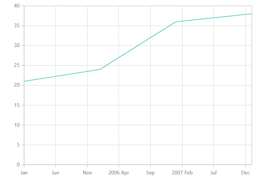
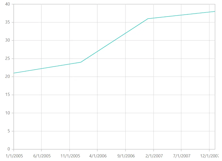
DateTime axis
The DateTime axis uses a date time scale and displays date time values as axis labels in the format specified.
A detailed walkthrough for customizing the dateTime axis is provided in the video below.
@using Syncfusion.Blazor.Charts

<SfChart>
    <ChartPrimaryXAxis ValueType="Syncfusion.Blazor.Charts.ValueType.DateTime">
    </ChartPrimaryXAxis>

    <ChartSeriesCollection>
        <ChartSeries DataSource="@WeatherReports" XName="XValue" YName="YValue" Type="ChartSeriesType.Line">
        </ChartSeries>
    </ChartSeriesCollection>
</SfChart>

@code{
    public class ChartData
    {
        public DateTime XValue { get; set; }
        public double YValue { get; set; }
    }

    public List<ChartData> WeatherReports = new List<ChartData>
	{
		new ChartData { XValue = new DateTime(2005, 01, 01), YValue = 21 },
		new ChartData { XValue = new DateTime(2006, 01, 01), YValue = 24 },
		new ChartData { XValue = new DateTime(2007, 01, 01), YValue = 36 },
		new ChartData { XValue = new DateTime(2008, 01, 01), YValue = 38 },
	};
}
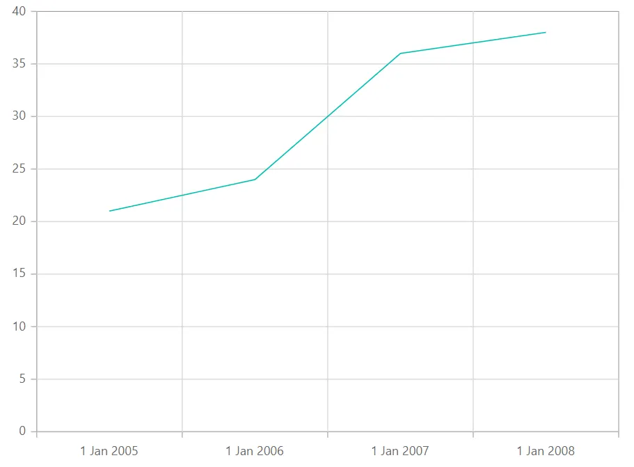
DateTime category axis
The DateTime Category axis is used to display date-time values with non-linear intervals. For example, the business days alone can be represented in a week here.
@using Syncfusion.Blazor.Charts

<SfChart>
    <ChartPrimaryXAxis Format="d MMM yyyy" ValueType="Syncfusion.Blazor.Charts.ValueType.DateTimeCategory">
    </ChartPrimaryXAxis>

    <ChartSeriesCollection>
        <ChartSeries DataSource="@WeatherReports" XName="XValue" YName="YValue" Type="ChartSeriesType.Line">
        </ChartSeries>
    </ChartSeriesCollection>
</SfChart>

@code{
    public class ChartData
    {
        public DateTime XValue { get; set; }
        public double YValue { get; set; }
    }

    public List<ChartData> WeatherReports = new List<ChartData>
	{
		new ChartData { XValue = new DateTime(2005, 01, 01), YValue = 21 },
		new ChartData { XValue = new DateTime(2006, 01, 01), YValue = 24 },
		new ChartData { XValue = new DateTime(2007, 01, 01), YValue = 36 },
		new ChartData { XValue = new DateTime(2008, 01, 01), YValue = 38 },
	};
}
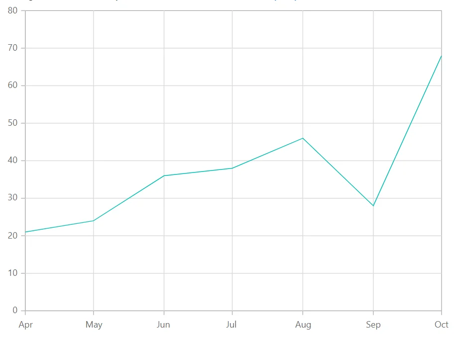
Range
The axis range will be calculated automatically based on the provided data; however, the axis range can also be customized using Minimum, Maximum, and Interval properties.
@using Syncfusion.Blazor.Charts

<SfChart>
    <ChartPrimaryXAxis  IntervalType="IntervalType.Years" ValueType="Syncfusion.Blazor.Charts.ValueType.DateTime">
    </ChartPrimaryXAxis>

    <ChartSeriesCollection>
        <ChartSeries DataSource="@WeatherReports" XName="XValue" YName="YValue" Type="ChartSeriesType.Line">
        </ChartSeries>
    </ChartSeriesCollection>
</SfChart>

@code{
    public class ChartData
    {
        public DateTime XValue { get; set; }
        public double YValue { get; set; }
    }

    public List<ChartData> WeatherReports = new List<ChartData>
	{
		new ChartData { XValue = new DateTime(2016, 4, 1), YValue = 21 },
		new ChartData { XValue = new DateTime(2016, 5, 1), YValue = 24 },
		new ChartData { XValue = new DateTime(2016, 6, 1), YValue = 36 },
		new ChartData { XValue = new DateTime(2016, 7, 1), YValue = 38 },
		new ChartData { XValue = new DateTime(2016, 8, 1), YValue = 46 },
		new ChartData { XValue = new DateTime(2016, 9, 1), YValue = 28 },
		new ChartData { XValue = new DateTime(2016, 10, 1), YValue = 68 }
	};
}
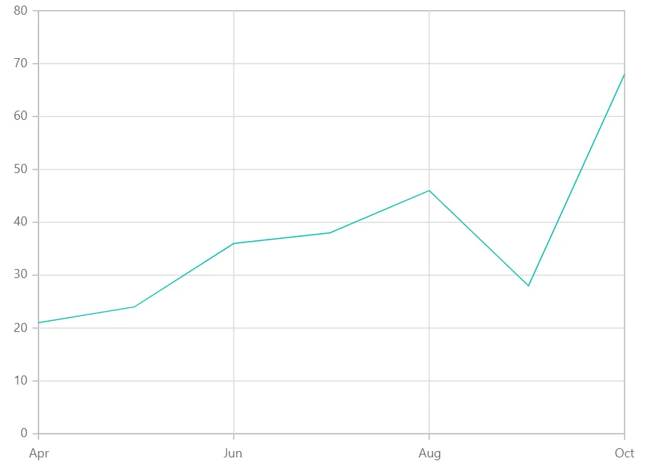
Interval customization
The Interval and IntervalType properties of the Axis can be used to customize date time intervals. When interval is set to 2 and interval type is set to Years, it considers 2 years to be the interval. The following interval types are supported by the DateTime axis:
- Auto
- Years
- Months
- Days
- Hours
- Minutes
- Seconds
@using Syncfusion.Blazor.Charts

<SfChart>

	<ChartPrimaryXAxis Interval="2" IntervalType="IntervalType.Months" ValueType="Syncfusion.Blazor.Charts.ValueType.DateTime">
    </ChartPrimaryXAxis>

    <ChartSeriesCollection>
        <ChartSeries DataSource="@WeatherReports" XName="XValue" YName="YValue" Type="ChartSeriesType.Line">
        </ChartSeries>
    </ChartSeriesCollection>
</SfChart>

@code{
    public class ChartData
    {
        public DateTime XValue { get; set; }
        public double YValue { get; set; }
    }

    public List<ChartData> WeatherReports = new List<ChartData>
	{
		new ChartData { XValue = new DateTime(2016, 4, 1), YValue = 21 },
		new ChartData { XValue = new DateTime(2016, 5, 1), YValue = 24 },
		new ChartData { XValue = new DateTime(2016, 6, 1), YValue = 36 },
		new ChartData { XValue = new DateTime(2016, 7, 1), YValue = 38 },
		new ChartData { XValue = new DateTime(2016, 8, 1), YValue = 46 },
		new ChartData { XValue = new DateTime(2016, 9, 1), YValue = 28 },
		new ChartData { XValue = new DateTime(2016, 10, 1), YValue = 68 }
	};
}
Applying padding to the Range
The RangePadding property can be used to apply padding to the minimum and maximum extremes of range. The following types of padding are supported by the DateTime axis:
- None
- Round
- Additional
DateTime - None
When the RangePadding is set to None, the minimum and maximum of the axis is based on the data.
@using Syncfusion.Blazor.Charts

<SfChart>
    <ChartPrimaryXAxis RangePadding="ChartRangePadding.None" ValueType="Syncfusion.Blazor.Charts.ValueType.DateTime">
    </ChartPrimaryXAxis>

    <ChartSeriesCollection>
        <ChartSeries DataSource="@WeatherReports" XName="XValue" YName="YValue" Type="ChartSeriesType.Line">
        </ChartSeries>
    </ChartSeriesCollection>
</SfChart>

@code{
    public class ChartData
    {
        public DateTime XValue { get; set; }
        public double YValue { get; set; }
    }

    public List<ChartData> WeatherReports = new List<ChartData>
	{
		new ChartData { XValue = new DateTime(2005, 01, 01), YValue = 21 },
		new ChartData { XValue = new DateTime(2006, 01, 01), YValue = 24 },
		new ChartData { XValue = new DateTime(2007, 01, 01), YValue = 36 },
		new ChartData { XValue = new DateTime(2008, 01, 01), YValue = 38 },
    };
}DateTime - Round
When the RangePadding property is set to Round, the minimum and maximum will be rounded to the nearest possible value divisible by interval.
@using Syncfusion.Blazor.Charts

<SfChart>
    <ChartPrimaryXAxis RangePadding="ChartRangePadding.Round" ValueType="Syncfusion.Blazor.Charts.ValueType.DateTime">
    </ChartPrimaryXAxis>

    <ChartSeriesCollection>
        <ChartSeries DataSource="@WeatherReports" XName="XValue" YName="YValue" Type="ChartSeriesType.Line">
        </ChartSeries>
    </ChartSeriesCollection>
</SfChart>

@code{
    public class ChartData
    {
        public DateTime XValue { get; set; }
        public double YValue { get; set; }
    }

    public List<ChartData> WeatherReports = new List<ChartData>
	{
		new ChartData { XValue = new DateTime(2005, 01, 01), YValue = 21 },
		new ChartData { XValue = new DateTime(2006, 01, 01), YValue = 24 },
		new ChartData { XValue = new DateTime(2007, 01, 01), YValue = 36 },
		new ChartData { XValue = new DateTime(2008, 01, 01), YValue = 38 },
    };
}DateTime - Additional
When the RangePadding property is set to Additional, the interval of an axis will be padded to the minimum and maximum of the axis.
@using Syncfusion.Blazor.Charts

<SfChart>
    <ChartPrimaryXAxis RangePadding="ChartRangePadding.Additional"
                       ValueType="Syncfusion.Blazor.Charts.ValueType.DateTime"/>

    <ChartSeriesCollection>
        <ChartSeries DataSource="@WeatherReports" XName="XValue" YName="YValue" Type="ChartSeriesType.Line" />
    </ChartSeriesCollection>
</SfChart>

@code{
    public class ChartData
    {
        public DateTime XValue { get; set; }
        public double YValue { get; set; }
    }

    public List<ChartData> WeatherReports = new List<ChartData>
	{
		new ChartData { XValue = new DateTime(2005, 01, 01), YValue = 21 },
		new ChartData { XValue = new DateTime(2006, 01, 01), YValue = 24 },
		new ChartData { XValue = new DateTime(2007, 01, 01), YValue = 36 },
		new ChartData { XValue = new DateTime(2008, 01, 01), YValue = 38 },
    };
}Label format
Using the LabelFormat property on an axis, it is possible to format and parse the date to all globalize formats.
@using Syncfusion.Blazor.Charts

<SfChart>
    <ChartPrimaryXAxis LabelFormat="d" ValueType="Syncfusion.Blazor.Charts.ValueType.DateTime"/>

    <ChartSeriesCollection>
        <ChartSeries DataSource="@WeatherReports" XName="XValue" YName="YValue" Type="ChartSeriesType.Line" />
    </ChartSeriesCollection>
</SfChart>

@code{
    public class ChartData
    {
        public DateTime XValue { get; set; }
        public double YValue { get; set; }
    }

    public List<ChartData> WeatherReports = new List<ChartData>
	{
		new ChartData { XValue = new DateTime(2005, 01, 01), YValue = 21 },
		new ChartData { XValue = new DateTime(2006, 01, 01), YValue = 24 },
		new ChartData { XValue = new DateTime(2007, 01, 01), YValue = 36 },
		new ChartData { XValue = new DateTime(2008, 01, 01), YValue = 38 },
    };
}
The table below shows the results of applying various popular date and time formats to the LabelFormat property.
| Label Value | Label Format Property Value | Result | Description |
| new Date(2000, 03, 10) | EEEE | Monday | The date is displayed in day format. |
| new Date(2000, 03, 10) | yMd | 04/10/2000 | The date is displayed in month/date/year format. |
| new Date(2000, 03, 10) | MMM | Apr | The shorthand month for the date is displayed. |
| new Date(2000, 03, 10) | hm | 12:00 AM | Time of the date value is displayed as label. |
| new Date(2000, 03, 10) | hms | 12:00:00 AM | The label is displayed in hours:minutes:seconds format. |
NOTE
Refer to the Blazor Charts feature tour page for its groundbreaking feature representations and also explore the Blazor Chart Example to know various chart types and how to represent time-dependent data, showing trends at equal intervals.