Stripline in Blazor Charts Component
18 Jun 202621 minutes to read
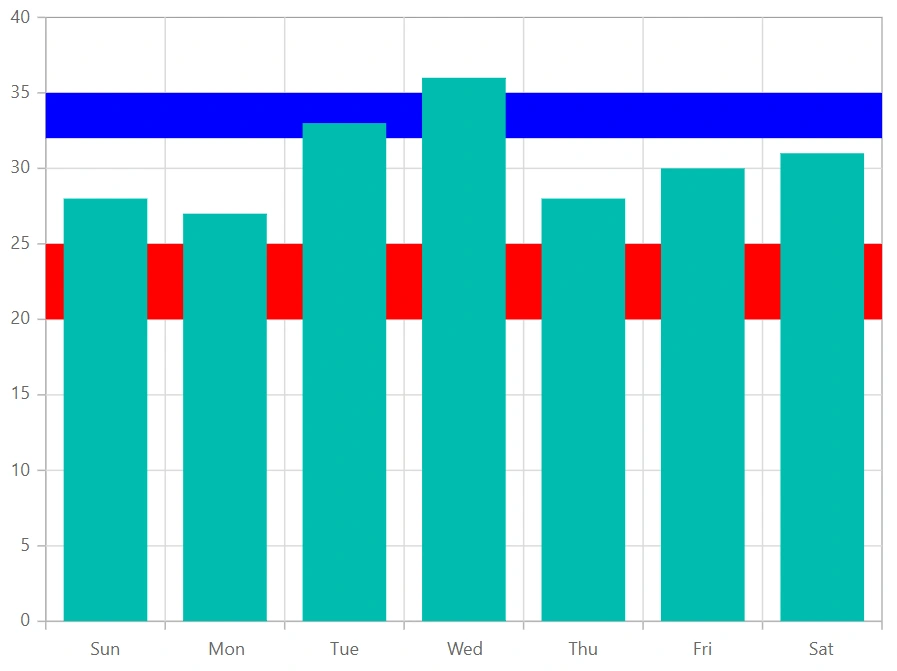
Horizontal striplines
By adding the ChartStripline on the vertical axis, one can create a horizontal stripline. Striplines are drawn in the provided start-to-end range, and an axis can have multiple striplines.
@using Syncfusion.Blazor.Charts

<SfChart>
    <ChartPrimaryXAxis ValueType="Syncfusion.Blazor.Charts.ValueType.Category"/>

    <ChartPrimaryYAxis>
        <ChartStriplines>
            <ChartStripline Start="20" End="25" Color="red"/>
            <ChartStripline Start="32" End="35" Color="blue"/>
        </ChartStriplines>
    </ChartPrimaryYAxis>

    <ChartSeriesCollection>
        <ChartSeries Type="ChartSeriesType.Column" DataSource="@WeatherReports" XName="X" YName="Y">
        </ChartSeries>
    </ChartSeriesCollection>

</SfChart>

@code{
    public class ChartData
    {
        public string X { get; set; }
        public double Y { get; set; }
    }

    public List<ChartData> WeatherReports = new List<ChartData>
	{
		new ChartData { X = "Sun", Y = 28 },
		new ChartData { X = "Mon", Y = 27 },
		new ChartData { X = "Tue", Y = 33 },
		new ChartData { X = "Wed", Y = 36 },
		new ChartData { X = "Thu", Y = 28 },
		new ChartData { X = "Fri", Y = 30 },
		new ChartData { X = "Sat", Y = 31 }
    };
}
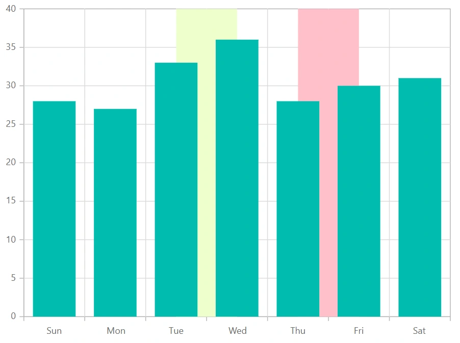
Vertical striplines
By adding the ChartStripline on the horizontal axis, one can create a vertical stripline. Striplines are drawn in the provided start-to-end range, and an axis can have multiple striplines.
@using Syncfusion.Blazor.Charts

<SfChart>
    <ChartPrimaryXAxis ValueType="Syncfusion.Blazor.Charts.ValueType.Category">
        <ChartStriplines>
            <ChartStripline Start="2" End="3" Color="#EEFFCC" />
            <ChartStripline Start="4" End="5" Color="pink" />
        </ChartStriplines>
    </ChartPrimaryXAxis>

    <ChartSeriesCollection>
        <ChartSeries Type="ChartSeriesType.Column" DataSource="@WeatherReports" XName="X" YName="Y">
        </ChartSeries>
    </ChartSeriesCollection>
</SfChart>

@code{
    public class ChartData
    {
        public string X { get; set; }
        public double Y { get; set; }
    }

    public List<ChartData> WeatherReports = new List<ChartData>
    {
		new ChartData { X = "Sun", Y = 28 },
		new ChartData { X = "Mon", Y = 27 },
		new ChartData { X = "Tue", Y = 33 },
		new ChartData { X = "Wed", Y = 36 },
		new ChartData { X = "Thu", Y = 28 },
		new ChartData { X = "Fri", Y = 30 },
		new ChartData { X = "Sat", Y = 31 }
    };
}
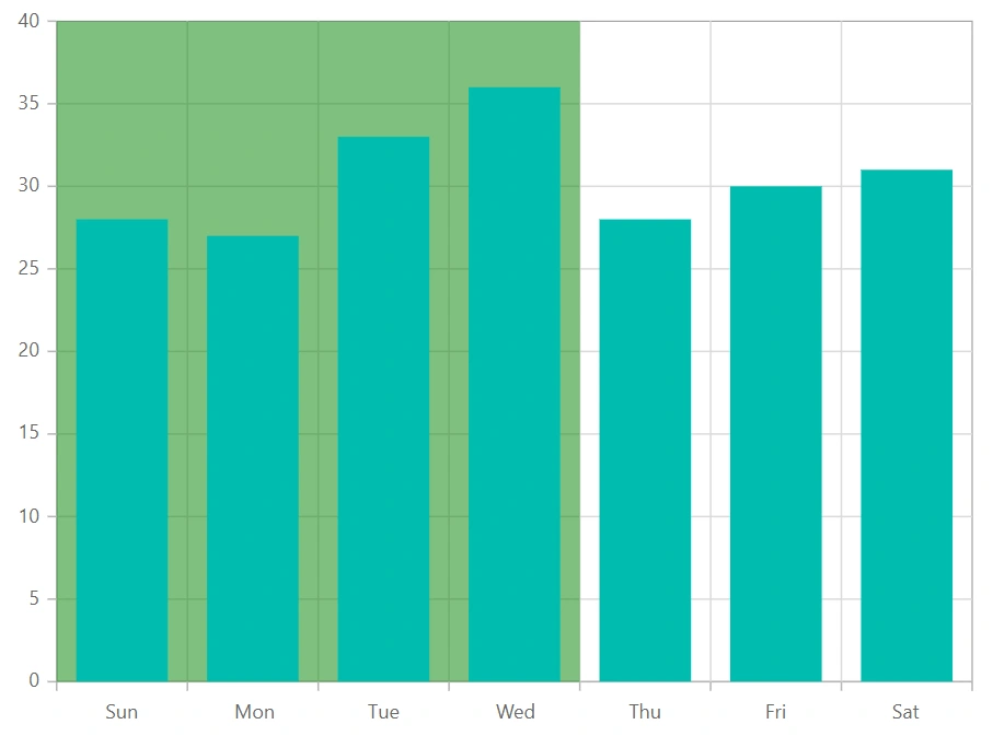
Striplines customization
The Start property in a stripline can be used to customize the starting value in that stripline. The End property customizes the end value in the same way. Both Size and Border properties can be used to customize the stripline’s size and border. The ZIndex property can be used to alter the order of the stripline, determining whether it should be drawn behind or over the series elements.
@using Syncfusion.Blazor.Charts

<SfChart>
    <ChartPrimaryXAxis ValueType="Syncfusion.Blazor.Charts.ValueType.Category">
        <ChartStriplines>
            <ChartStripline StartFromAxis="true" Size="4" ZIndex="ZIndex.Behind" Opacity="0.5" Color="green"/>
        </ChartStriplines>
    </ChartPrimaryXAxis>

    <ChartSeriesCollection>
        <ChartSeries Type="ChartSeriesType.Column" DataSource="@WeatherReports" XName="X" YName="Y">
        </ChartSeries>
    </ChartSeriesCollection>
</SfChart>

@code{

    public class ChartData
    {
        public string X { get; set; }
        public double Y { get; set; }
    }

    public List<ChartData> WeatherReports = new List<ChartData>
	{
		new ChartData { X = "Sun", Y = 28 },
		new ChartData { X = "Mon", Y = 27 },
		new ChartData { X = "Tue", Y = 33 },
		new ChartData { X = "Wed", Y = 36 },
		new ChartData { X = "Thu", Y = 28 },
		new ChartData { X = "Fri", Y = 30 },
		new ChartData { X = "Sat", Y = 31 }
	};
}
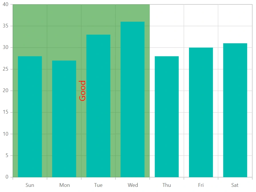
Text customization
TextStyle and Rotation properties can be used to customize and rotate the text presented in a stripline. The HorizontalAlignment and VerticalAlignment properties can be used to customize the horizontal and vertical alignment of the stripline text.
@using Syncfusion.Blazor.Charts

<SfChart>
    <ChartPrimaryXAxis ValueType="Syncfusion.Blazor.Charts.ValueType.Category">
        <ChartStriplines>
            <ChartStripline StartFromAxis="true" Size="4" ZIndex="ZIndex.Behind" Opacity="0.5" Color="green" Text="Good"
                            HorizontalAlignment="Anchor.Middle" VerticalAlignment="Anchor.Middle">
                <ChartStriplineTextStyle Size="20px" Color="red"/>
            </ChartStripline>
        </ChartStriplines>
    </ChartPrimaryXAxis>

    <ChartSeriesCollection>
        <ChartSeries Type="ChartSeriesType.Column" DataSource="@WeatherReports" XName="X" YName="Y">
        </ChartSeries>
    </ChartSeriesCollection>
</SfChart>

@code{

    public class ChartData
    {
        public string X { get; set; }
        public double Y { get; set; }
    }

    public List<ChartData> WeatherReports = new List<ChartData>
	{
		new ChartData { X = "Sun", Y = 28 },
		new ChartData { X = "Mon", Y = 27 },
		new ChartData { X = "Tue", Y = 33 },
		new ChartData { X = "Wed", Y = 36 },
		new ChartData { X = "Thu", Y = 28 },
		new ChartData { X = "Fri", Y = 30 },
		new ChartData { X = "Sat", Y = 31 }
	};
}
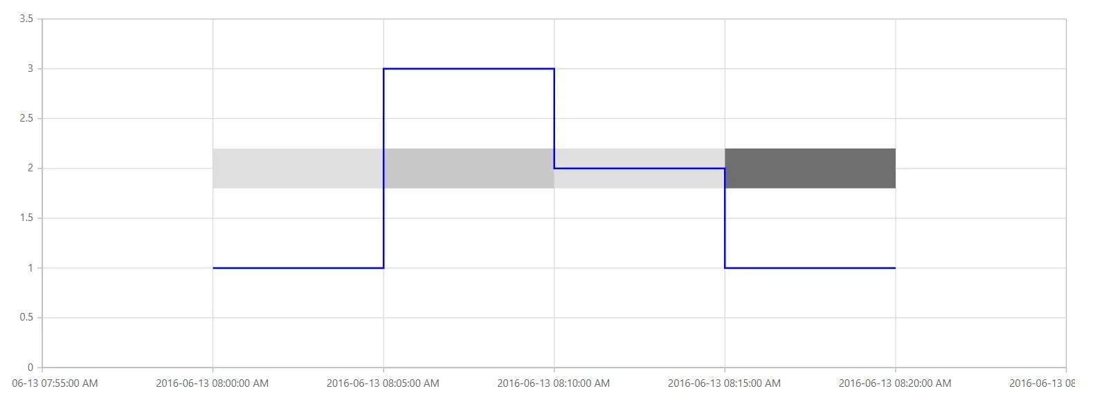
Segmented stripline
To create a stripline in a specific region with respect to a segment (segmented stripline), you can use the IsSegmented property of the ChartStripline. The start and end values of this type of stripline can be defined through the SegmentStart and SegmentEnd properties. Additionally, you can use the Color property to set the color of the segment and the SegmentAxisName property to specify the axis for the segment stripline.
- IsSegmented - It is used to enable the segmented stripline.
- SegmentStart - Used to change the start value of the segment, which corresponds to the associated axis.
- SegmentEnd - Used to change the end value of the segment, which also corresponds to the associated axis.
- SegmentAxisName - Used to specify the name of the associated axis.
- Color - Used to customize the color for the stripline.
@using Syncfusion.Blazor.Charts

<SfChart>
    <ChartPrimaryXAxis Minimum="@Minimum" Maximum="@Maximum" LabelFormat="yyyy-MM-dd HH:mm:ss tt" Interval="5" IntervalType="IntervalType.Minutes" ValueType="Syncfusion.Blazor.Charts.ValueType.DateTime">
        <ChartStriplines>
            <ChartStripline Start="new DateTime(2016, 06, 13, 08, 00, 00)" End="new DateTime(2016, 06, 13, 08, 05, 00)" Color="#E0E0E0" IsSegmented="true" SegmentStart="1.8" SegmentAxisName="PrimaryYAxis" SegmentEnd="2.2" StartFromAxis="false" />
            <ChartStripline Start="new DateTime(2016, 06, 13, 08, 05, 00)" End="new DateTime(2016, 06, 13, 08, 10, 00)" Color="#C8C8C8" IsSegmented="true" SegmentStart="1.8" SegmentAxisName="PrimaryYAxis" SegmentEnd="2.2" StartFromAxis="false" />
            <ChartStripline Start="new DateTime(2016, 06, 13, 08, 10, 00)" End="new DateTime(2016, 06, 13, 08, 15, 00)" Color="#E0E0E0" IsSegmented="true" SegmentStart="1.8" SegmentAxisName="PrimaryYAxis" SegmentEnd="2.2" StartFromAxis="false" />
            <ChartStripline Start="new DateTime(2016, 06, 13, 08, 15, 00)" End="new DateTime(2016, 06, 13, 08, 20, 00)" Color="#6e6e6e" IsSegmented="true" SegmentStart="1.8" SegmentAxisName="PrimaryYAxis" SegmentEnd="2.2" StartFromAxis="false" />
        </ChartStriplines>
    </ChartPrimaryXAxis>
    <ChartPrimaryYAxis Interval="0.5" Minimum="0" Maximum="3.5"></ChartPrimaryYAxis>
    <ChartSeriesCollection>
        <ChartSeries Fill="blue" DataSource="@StepLineData" Width="2" XName="X" YName="Y" Type="Syncfusion.Blazor.Charts.ChartSeriesType.StepLine">
        </ChartSeries>
    </ChartSeriesCollection>
</SfChart>

@code {
    public DateTime Minimum { get; set; } = new DateTime(2016, 06, 13, 07, 55, 00);
    public DateTime Maximum { get; set; } = new DateTime(2016, 06, 13, 08, 25, 00);

    public class ChartData
    {
        public DateTime X { get; set; }
        public double Y { get; set; }
    }

    public List<ChartData> StepLineData = new List<ChartData>
    {
        new ChartData { X= new DateTime(2016, 06, 13,08,00,00), Y= 1 },
        new ChartData { X= new DateTime(2016, 06, 13,08,05,00), Y= 3 },
        new ChartData { X= new DateTime(2016, 06, 13,08,10,00), Y= 2 },
        new ChartData { X= new DateTime(2016, 06, 13,08,15,00), Y= 1 },
        new ChartData { X= new DateTime(2016, 06, 13,08,20,00), Y= 1 }
    };
}
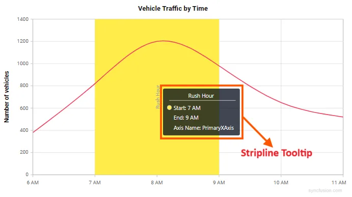
Stripline tooltip
Stripline tooltips provide additional contextual information on interaction with striplines in the chart. To display a tooltip on a stripline, add the ChartStriplineTooltip component inside the desired ChartStripline and set the Enable property to true. It is particularly useful for explaining the significance of specific ranges or thresholds marked by striplines.
Default stripline tooltip code example:
Below is the simplest way to enable a stripline tooltip using default settings. The tooltip will display on interaction with the stripline.
@using Syncfusion.Blazor.Charts

@* Initialize the Chart to display vehicle traffic by time using a Spline series. *@
<SfChart Title="Vehicle Traffic by Time">
    <ChartPrimaryXAxis ValueType="Syncfusion.Blazor.Charts.ValueType.DateTime"
                       IntervalType="IntervalType.Hours"
                       LabelFormat="h tt">
        <ChartStriplines>

            @* Stripline: visual band marking Rush Hour on the X axis *@
            <ChartStripline Start="new DateTime(2024, 01, 01, 07, 00, 00)"
                            End="new DateTime(2024, 01, 01, 09, 00, 00)"
                            Text="Rush Hour"
                            Color="#FFED4A"
                            Visible="true">

                @* Stripline Tooltip: shows 'Rush Hour' with band hover/tap *@
                <ChartStriplineTooltip Enable="true"></ChartStriplineTooltip>
            </ChartStripline>
        </ChartStriplines>
    </ChartPrimaryXAxis>

    <ChartPrimaryYAxis Minimum="0" Maximum="1400" Interval="200" Title="Number of vehicles">
    </ChartPrimaryYAxis>

    <ChartSeriesCollection>
        <ChartSeries Type="ChartSeriesType.Spline"
                     DataSource="@Traffic"
                     XName="Time"
                     YName="Vehicles"
                     Width="2"
                     Fill="#F43F5E">
        </ChartSeries>
    </ChartSeriesCollection>
</SfChart>

@code {
    public class TrafficPoint
    {
        public DateTime Time { get; set; }
        public double Vehicles { get; set; }
    }

    public List<TrafficPoint> Traffic = new ()
    {
        new TrafficPoint { Time = new DateTime(2024, 01, 01, 06, 00, 00), Vehicles = 380 },
        new TrafficPoint { Time = new DateTime(2024, 01, 01, 07, 00, 00), Vehicles = 820 },
        new TrafficPoint { Time = new DateTime(2024, 01, 01, 08, 00, 00), Vehicles = 1200 },
        new TrafficPoint { Time = new DateTime(2024, 01, 01, 09, 00, 00), Vehicles = 980 },
        new TrafficPoint { Time = new DateTime(2024, 01, 01, 10, 00, 00), Vehicles = 650 },
        new TrafficPoint { Time = new DateTime(2024, 01, 01, 11, 00, 00), Vehicles = 520 }
    };
}
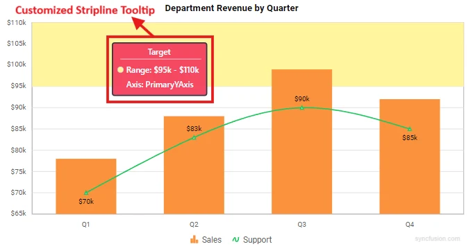
Tooltip customization properties
The stripline tooltip offers comprehensive customization options through the following properties:
-
Enable - A boolean property that enables or disables the stripline tooltip. Default value is false.
-
Header - Defines the title text displayed at the top of the tooltip.
-
Content - Allows you to specify custom content for the tooltip body using a format string. The format supports token placeholders that are replaced with corresponding values at runtime. Supported tokens:
- ${stripline.text} – The stripline label.
- ${stripline.start} – The stripline start value.
- ${stripline.end} – The stripline end value.
- ${axis.name} – The axis name.
- ${stripline.segmentStart} – The stripline segment start value (if applicable).
- ${stripline.segmentEnd} – The stripline segment end value (if applicable).
- ${stripline.segmentAxisName} – The stripline segment axis name (if applicable).
- ${stripline.size} – The stripline size (if applicable).
-
Fill - Sets the background color of the tooltip. Accepts any valid CSS color value (hex, rgb, rgba, named colors).
-
Opacity - Controls the transparency level of the tooltip background. Accepts numeric values between 0 (completely transparent) and 1 (completely opaque). The default value is 0.75.
- ShowHeaderLine - A boolean property that controls the visibility of the horizontal separator line between the tooltip header and content. Set to true to display the line or false to hide it.
The ChartStriplineTooltipTextStyle component allows you to customize the appearance of text within the tooltip:
-
Size - Specifies the font size of the tooltip text. Accepts pixel values (e.g., “12px”).
-
Color - Defines the text color. Accepts any valid CSS color value.
-
FontFamily - Sets the font family for the tooltip text. Accepts standard CSS font family values (e.g., “Arial”, “Segoe UI”, “Roboto”).
-
FontWeight - Controls the thickness of the text.
The ChartStriplineTooltipBorder component enables you to add and customize borders around the tooltip:
-
Width - Specifies the thickness of the tooltip border in pixels. Accepts numeric values. Default value is 0.
-
Color - Defines the color of the tooltip border. Accepts any valid CSS color value.
Customized stripline tooltip code example:
@using Syncfusion.Blazor.Charts

@* Initialize the Chart to display department revenue by quarter using Column and Spline series. *@
<SfChart Title="Department Revenue by Quarter">
    <ChartPrimaryXAxis ValueType="Syncfusion.Blazor.Charts.ValueType.Category">
        <ChartAxisMajorGridLines Width="0"></ChartAxisMajorGridLines>
        <ChartAxisMajorTickLines Width="0"></ChartAxisMajorTickLines>
    </ChartPrimaryXAxis>

    <ChartPrimaryYAxis Minimum="65" Maximum="110" Interval="5" LabelFormat="${value}k" RangePadding="Syncfusion.Blazor.Charts.ChartRangePadding.None">
        <ChartAxisMajorTickLines Width="0"></ChartAxisMajorTickLines>
        <ChartStriplines>

            @* Stripline: Highlights the upper revenue target range from 95k to 110k with text style and border customization. *@
            <ChartStripline Start="95" End="110" Color="#FFF59E" HorizontalAlignment="Anchor.Middle" Visible="true">
                <ChartStriplineTextStyle Size="12px" Color="#0b3a66" FontWeight="600"></ChartStriplineTextStyle>
                <ChartStriplineBorder Width="0"></ChartStriplineBorder>

                @* Stripline Tooltip: providing interactive context with customizatioon for the target bands over hover/tap *@
                <ChartStriplineTooltip Enable="true"
                                       Header="Target"
                                       Content="Range: ${stripline.start} - ${stripline.end}<br/>Axis: ${axis.name}"
                                       Fill="#F43F5E"
                                       Opacity="0.95"
                                       ShowHeaderLine="true">
                    <ChartStriplineTooltipTextStyle Size="14px" Color="#FFFFFF" FontWeight="600" FontFamily="Segoe UI"></ChartStriplineTooltipTextStyle>
                    <ChartStriplineTooltipBorder Width="2" Color="#1F2937"></ChartStriplineTooltipBorder>
                </ChartStriplineTooltip>
            </ChartStripline>
        </ChartStriplines>
    </ChartPrimaryYAxis>

    <ChartSeriesCollection>
        <ChartSeries Name="Sales" Type="ChartSeriesType.Column" DataSource="@SalesData" XName="Quarter" YName="Revenue" ColumnSpacing="0.2" Width="2" Fill="#FB923C">
            <ChartMarker Visible="false"></ChartMarker>
        </ChartSeries>
        <ChartSeries Name="Support" Type="ChartSeriesType.Spline" DataSource="@SupportData" XName="Quarter" YName="Revenue" Width="2" Fill="#22C55E">
            <ChartMarker Visible="true">
                <ChartDataLabel Visible="true"></ChartDataLabel>
            </ChartMarker>
        </ChartSeries>
    </ChartSeriesCollection>

    <ChartLegendSettings Visible="true" EnableHighlight="true"></ChartLegendSettings>
</SfChart>

@code {
    public class RevenuePoint
    {
        public string Quarter { get; set; }
        public double Revenue { get; set; }
    }

    public List<RevenuePoint> SalesData = new ()
    {
        new RevenuePoint { Quarter = "Q1", Revenue = 78 },
        new RevenuePoint { Quarter = "Q2", Revenue = 88 },
        new RevenuePoint { Quarter = "Q3", Revenue = 99 },
        new RevenuePoint { Quarter = "Q4", Revenue = 92 }
    };

    public List<RevenuePoint> SupportData = new ()
    {
        new RevenuePoint { Quarter = "Q1", Revenue = 70 },
        new RevenuePoint { Quarter = "Q2", Revenue = 83 },
        new RevenuePoint { Quarter = "Q3", Revenue = 90 },
        new RevenuePoint { Quarter = "Q4", Revenue = 85 }
    };
}
NOTE
Refer to the Blazor Charts feature tour page for its groundbreaking feature representations and also explore the Blazor Chart Example to know various chart types and how to represent time-dependent data, showing trends at equal intervals.