Getting Started with Blazor ComboBox Component
30 Apr 20257 minutes to read
This section briefly explains about how to include Blazor ComboBox component in your Blazor WebAssembly App using Visual Studio and Visual Studio Code.
To get started quickly with Blazor ComboBox component, you can check out this video or GitHub sample.
Prerequisites
Create a new Blazor App in Visual Studio
You can create a Blazor WebAssembly App using Visual Studio via Microsoft Templates or the Syncfusion® Blazor Extension.
Install Syncfusion® Blazor DropDowns and Themes NuGet in the App
To add Blazor ComboBox component in the app, open the NuGet package manager in Visual Studio (Tools → NuGet Package Manager → Manage NuGet Packages for Solution), search and install Syncfusion.Blazor.DropDowns and Syncfusion.Blazor.Themes. Alternatively, you can utilize the following package manager command to achieve the same.
Install-Package Syncfusion.Blazor.DropDowns -Version 29.1.33
Install-Package Syncfusion.Blazor.Themes -Version 29.1.33
NOTE
Syncfusion® Blazor components are available in nuget.org. Refer to NuGet packages topic for available NuGet packages list with component details.
Prerequisites
Create a new Blazor App in Visual Studio Code
You can create a Blazor WebAssembly App using Visual Studio Code via Microsoft Templates or the Syncfusion® Blazor Extension.
Alternatively, you can create a WebAssembly application using the following command in the terminal(Ctrl+`).
dotnet new blazorwasm -o BlazorApp
cd BlazorApp
Install Syncfusion® Blazor DropDowns and Themes NuGet in the App
- Press Ctrl+` to open the integrated terminal in Visual Studio Code.
- Ensure you’re in the project root directory where your
.csprojfile is located. - Run the following command to install a Syncfusion.Blazor.DropDowns and Syncfusion.Blazor.Themes NuGet package and ensure all dependencies are installed.
dotnet add package Syncfusion.Blazor.DropDowns -v 29.1.33
dotnet add package Syncfusion.Blazor.Themes -v 29.1.33
dotnet restore
NOTE
Syncfusion® Blazor components are available in nuget.org. Refer to NuGet packages topic for available NuGet packages list with component details.
Register Syncfusion® Blazor Service
Open ~/_Imports.razor file and import the Syncfusion.Blazor and Syncfusion.Blazor.DropDowns namespace.
@using Syncfusion.Blazor
@using Syncfusion.Blazor.DropDowns
Now, register the Syncfusion® Blazor Service in the ~/Program.cs file of your Blazor WebAssembly App.
using Microsoft.AspNetCore.Components.Web;
using Microsoft.AspNetCore.Components.WebAssembly.Hosting;
using Syncfusion.Blazor;

var builder = WebAssemblyHostBuilder.CreateDefault(args);
builder.RootComponents.Add<App>("#app");
builder.RootComponents.Add<HeadOutlet>("head::after");

builder.Services.AddScoped(sp => new HttpClient { BaseAddress = new Uri(builder.HostEnvironment.BaseAddress) });

builder.Services.AddSyncfusionBlazor();
await builder.Build().RunAsync();
....
Add stylesheet and script resources
The theme stylesheet and script can be accessed from NuGet through Static Web Assets. Include the stylesheet and script references in the <head> section of the ~/index.html file.
<head>
    ....
    <link href="_content/Syncfusion.Blazor.Themes/bootstrap5.css" rel="stylesheet" />
    <script src="_content/Syncfusion.Blazor.Core/scripts/syncfusion-blazor.min.js" type="text/javascript"></script>
</head>
NOTE
Check out the Blazor Themes topic to discover various methods (Static Web Assets, CDN, and CRG) for referencing themes in your Blazor application. Also, check out the Adding Script Reference topic to learn different approaches for adding script references in your Blazor application.
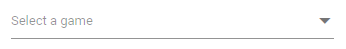
Add Blazor ComboBox component
Add the Syncfusion® Blazor ComboBox component in the ~/Pages/Index.razor file.
<SfComboBox TValue="string" TItem="string" Placeholder="Select a game"></SfComboBox>- Press Ctrl+F5 (Windows) or ⌘+F5 (macOS) to launch the application. This will render the Syncfusion® Blazor ComboBox component in your default web browser.
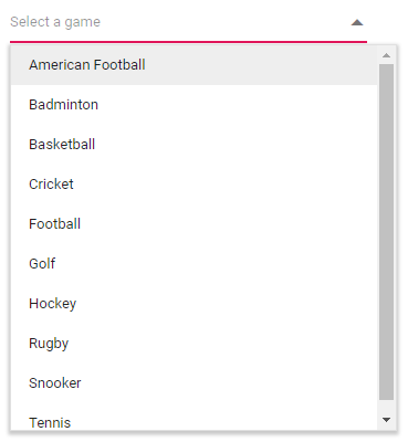
Binding data source
After initializing, populate the ComboBox with data using the DataSource property. Here, an array of string values is passed to the ComboBox component.
<SfComboBox TValue="string" TItem="Games" Placeholder="Select a game" DataSource="@LocalData">
    <ComboBoxFieldSettings Value="ID" Text="Text"></ComboBoxFieldSettings>
</SfComboBox>

@code {
  public class Games
  {
    public string ID { get; set; }
    public string Text { get; set; }
  }
  List<Games> LocalData = new List<Games> {
    new Games() { ID= "Game1", Text= "American Football" },
    new Games() { ID= "Game2", Text= "Badminton" },
    new Games() { ID= "Game3", Text= "Basketball" },
    new Games() { ID= "Game4", Text= "Cricket" },
    new Games() { ID= "Game5", Text= "Football" },
    new Games() { ID= "Game6", Text= "Golf" },
    new Games() { ID= "Game7", Text= "Hockey" },
    new Games() { ID= "Game8", Text= "Rugby"},
    new Games() { ID= "Game9", Text= "Snooker" },
    new Games() { ID= "Game10", Text= "Tennis"},
  };
}
Custom values
The ComboBox allows the users to give input as custom value, which is not required to present in predefined set of values. By default, this support is enabled by AllowCustom property. In this case, both text field and value field are considered as same. The custom value will be sent to post back handler when a form is about to be submitted.
<SfComboBox TValue="string"  TItem="Games" AllowCustom=true Placeholder="Select a game" DataSource="@LocalData">
    <ComboBoxFieldSettings Value="ID" Text="Text"></ComboBoxFieldSettings>
</SfComboBox>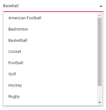
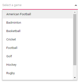
Configure the popup list
By default, the width of the popup list automatically adjusts according to the ComboBox input element’s width, and the height of the popup list has 350px. The height and width of the popup list can also be customized using the PopupHeight and PopupWidth properties respectively.
<SfComboBox TValue="string" TItem="Games"PopupHeight="350px" PopupWidth="350px" Placeholder="Select a game" DataSource="@LocalData">
    <ComboBoxFieldSettings Value="ID" Text="Text"></ComboBoxFieldSettings>
</SfComboBox>