Blazor DataGrid in a standalone WebAssembly app using .NET CLI
8 Jul 202624 minutes to read
This article provides step-by-step instructions to build a standalone Blazor WebAssembly app and integrate the Blazor DataGrid using the .NET CLI. The guidance aligns with .NET 8/9 Blazor WebAssembly project standards and notes when to use a hosted WebAssembly option.
Using the Playground
Blazor Playground allows interacting with Blazor components directly in a web browser without installing any NuGet packages locally. By default, the Syncfusion.Blazor package is included.
Manually creating a project
This section explains how to manually create a standalone Blazor WebAssembly app using the CLI.
Prerequisites
Install the latest .NET SDK for .NET 8/9. To verify installed SDKs, run:
dotnet --list-sdksTo check the current default .NET SDK version installed on a system, run the following command in a terminal or command prompt:
dotnet --versionCreate a standalone Blazor WebAssembly project using .NET CLI
To create a new standalone Blazor WebAssembly app targeting the latest supported framework, run one of the following:
dotnet new blazorwasm -o BlazorApp -f net8.0
cd BlazorApp
dotnet new blazorwasm -o BlazorApp -f net9.0
cd BlazorAppFor a hosted Blazor WebAssembly experience (with ASP.NET Core backend), add the hosted option:
dotnet new blazorwasm -o BlazorApp -f net8.0 --hosted
cd BlazorApp
dotnet new blazorwasm -o BlazorApp -f net9.0 --hosted
cd BlazorAppNOTE
If the project is created without specifying -f, the template may default to an older target framework depending on the installed SDKs. Always include -f net8.0 or -f net9.0 to target the intended framework version. See the template options for details.
Install Blazor DataGrid and Themes NuGet in the app
To add the Syncfusion.Blazor.Grid NuGet package to the application, use the following command in the command prompt (Windows) or terminal (Linux/macOS). For more details, refer to Install and manage packages using the dotnet CLI.
dotnet add package Syncfusion.Blazor.Grid --version 34.1.29
dotnet add package Syncfusion.Blazor.Themes --version 34.1.29
dotnet restore
NOTE
Blazor components are available on nuget.org. Refer to the NuGet packages topic for the list of available packages and component details. If a project requires a license key, see the licensing topic to register it at startup.
Register Blazor service
- Import namespaces
Open the ~/_Imports.razor file and add the following namespaces:
@using Syncfusion.Blazor
@using Syncfusion.Blazor.Grids- Register the service
In ~/Program.cs, register the Blazor service as shown below:
using Microsoft.AspNetCore.Components.Web;
using Microsoft.AspNetCore.Components.WebAssembly.Hosting;
using Syncfusion.Blazor;

var builder = WebAssemblyHostBuilder.CreateDefault(args);
builder.RootComponents.Add<App>("#app");
builder.RootComponents.Add<HeadOutlet>("head::after");

builder.Services.AddScoped(serviceProvider => new HttpClient { BaseAddress = new Uri(builder.HostEnvironment.BaseAddress) });

builder.Services.AddSyncfusionBlazor();
await builder.Build().RunAsync();
Add stylesheet and script resources
The theme stylesheet and script can be accessed from NuGet through Static Web Assets. Reference the stylesheet and script in the <head> section of the main layout page as shown below:
For .NET 8/9 standalone Blazor WebAssembly apps, add the following to the wwwroot/index.html file:
<head>
    ....
    <link href="_content/Syncfusion.Blazor.Themes/bootstrap5.css" rel="stylesheet" />
</head>
<body>
    ....
    <script src="_content/Syncfusion.Blazor.Core/scripts/syncfusion-blazor.min.js" type="text/javascript"></script>
</body>
NOTE
See the Blazor Themes topic to discover methods (Static Web Assets, CDN, and CRG) for referencing themes. Also see Adding Script Reference for approaches to add script references.
Add Blazor DataGrid
Add the Blazor DataGrid in the ~/Pages/Home.razor file.
@using Syncfusion.Blazor.Grids

<SfGrid DataSource="@Orders"></SfGrid>

@code {
    public List<OrderData> Orders { get; set; }

    protected override void OnInitialized()
    {
        Orders = OrderData.GetAllRecords();
    }
}
public class OrderData
{
public static List<OrderData> Orders = new List<OrderData>();
public OrderData()
{
}
public OrderData( int? OrderID, string CustomerID)
{
this.OrderID = OrderID;
this.CustomerID = CustomerID;
}
public static List<OrderData> GetAllRecords()
{
if (Orders.Count() == 0)
{
int code = 10;
for (int i = 1; i < 2; i++)
{
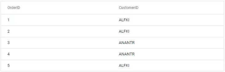
Orders.Add(new OrderData(1, "ALFKI"));
Orders.Add(new OrderData(2, "ALFKI"));
Orders.Add(new OrderData(3, "ANANTR"));
Orders.Add(new OrderData(4, "ANANTR"));
Orders.Add(new OrderData(5, "ALFKI"));
code += 5;
}
}
return Orders;
}
public int? OrderID { get; set; }
public string CustomerID { get; set; }
}- To build and run the Blazor WebAssembly application, use the following command in the terminal or command prompt:
dotnet runAfter the app starts, navigate to http://localhost:<port-number> in the browser to view the Grid.
Defining row data
To bind data for the Blazor DataGrid, assign a List<OrderData> (or any collection that implements IEnumerable<OrderData>) to the DataSource property. The list data source can also be provided as an instance of DataManager. Assign the data source in the OnInitialized lifecycle method of the page.
@using Syncfusion.Blazor.Grids

<SfGrid DataSource="@Orders"></SfGrid>

@code {
    public List<OrderData> Orders { get; set; }

    protected override void OnInitialized()
    {
        Orders = OrderData.GetAllRecords();
    }
}
public class OrderData
{
public static List<OrderData> Orders = new List<OrderData>();
public OrderData()
{
}
public OrderData( int? OrderID, string CustomerID, DateTime? OrderDate, double? Freight)
{
this.OrderID = OrderID;
this.CustomerID = CustomerID;
this.OrderDate = OrderDate;
this.Freight = Freight;
}
public static List<OrderData> GetAllRecords()
{
if (Orders.Count() == 0)
{
int code = 10;
for (int i = 1; i < 2; i++)
{
Orders.Add(new OrderData(10248, "VINET",new DateTime(1996,07,07), 32.38));
Orders.Add(new OrderData(10249, "TOMSP", new DateTime(1996, 07, 07), 92.38));
Orders.Add(new OrderData(10250, "HANAR", new DateTime(1996, 07, 07), 62.77));
Orders.Add(new OrderData(10251, "VICTE", new DateTime(1996, 07, 07), 12.38));
Orders.Add(new OrderData(10252, "SUPRD", new DateTime(1996, 07, 07), 82.38));
Orders.Add(new OrderData(10253, "CHOPS", new DateTime(1996, 07, 07), 31.31));
Orders.Add(new OrderData(10254, "RICSU", new DateTime(1996, 07, 07), 22.37));
Orders.Add(new OrderData(10255, "WELLI", new DateTime(1996, 07, 07), 44.34));
Orders.Add(new OrderData(10256, "RICSU", new DateTime(1996, 07, 07), 31.33));
code += 5;
}
}
return Orders;
}
public int? OrderID { get; set; }
public string CustomerID { get; set; }
public DateTime? OrderDate { get; set; }
public double? Freight { get; set; }
}Defining columns
Columns are automatically generated when the column declaration is empty or undefined during initialization of the Blazor DataGrid.
The Grid also supports explicitly defining columns using GridColumns. In GridColumn, several properties are available to customize column behavior.
Key properties in the example below:
- Field: Binds the column to a property on the data model.
- HeaderText: Sets the displayed column title.
- TextAlign: Controls the horizontal alignment of cell text.
- Format: Applies standard or custom formatting to numeric and date values.
- Type: Specifies the column data type.
- Width: Sets the column width.
@using Syncfusion.Blazor.Grids

<SfGrid DataSource="@Orders">
    <GridColumns>
        <GridColumn Field=@nameof(OrderData.OrderID) HeaderText="Order ID" TextAlign="Syncfusion.Blazor.Grids.TextAlign.Right" Width="120"></GridColumn>
        <GridColumn Field=@nameof(OrderData.CustomerID) HeaderText="Customer ID" Width="150"></GridColumn>
        <GridColumn Field=@nameof(OrderData.Freight) HeaderText="Freight" Format="C2" TextAlign="Syncfusion.Blazor.Grids.TextAlign.Right" Width="120"></GridColumn>
        <GridColumn Field=@nameof(OrderData.OrderDate) HeaderText="Order Date" Format="d" Type="Syncfusion.Blazor.Grids.ColumnType.Date" TextAlign="Syncfusion.Blazor.Grids.TextAlign.Right" Width="130"></GridColumn>
    </GridColumns>
</SfGrid>

@code {
   private SfGrid<OrderData> Grid;
    public List<OrderData> Orders { get; set; }

    protected override void OnInitialized()
    {
        Orders = OrderData.GetAllRecords();
    }
}
public class OrderData
{
public static List<OrderData> Orders = new List<OrderData>();
public OrderData()
{
}
public OrderData( int? OrderID, string CustomerID, DateTime? OrderDate, double? Freight)
{
this.OrderID = OrderID;
this.CustomerID = CustomerID;
this.OrderDate = OrderDate;
this.Freight = Freight;
}
public static List<OrderData> GetAllRecords()
{
if (Orders.Count() == 0)
{
int code = 10;
for (int i = 1; i < 2; i++)
{
Orders.Add(new OrderData(10248, "VINET",new DateTime(1996,07,07), 32.38));
Orders.Add(new OrderData(10249, "TOMSP", new DateTime(1996, 07, 07), 92.38));
Orders.Add(new OrderData(10250, "HANAR", new DateTime(1996, 07, 07), 62.77));
Orders.Add(new OrderData(10251, "VICTE", new DateTime(1996, 07, 07), 12.38));
Orders.Add(new OrderData(10252, "SUPRD", new DateTime(1996, 07, 07), 82.38));
Orders.Add(new OrderData(10253, "CHOPS", new DateTime(1996, 07, 07), 31.31));
Orders.Add(new OrderData(10254, "RICSU", new DateTime(1996, 07, 07), 22.37));
Orders.Add(new OrderData(10255, "WELLI", new DateTime(1996, 07, 07), 44.34));
Orders.Add(new OrderData(10256, "RICSU", new DateTime(1996, 07, 07), 31.33));
code += 5;
}
}
return Orders;
}
public int? OrderID { get; set; }
public string CustomerID { get; set; }
public DateTime? OrderDate { get; set; }
public double? Freight { get; set; }
}Enable paging
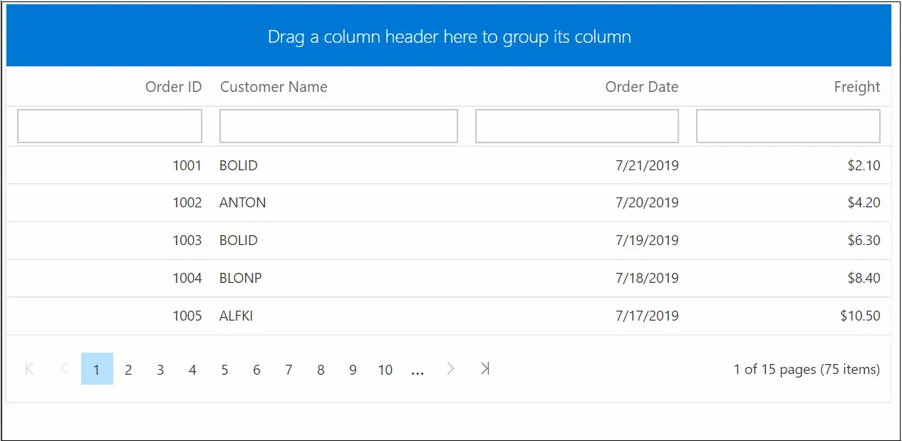
The Blazor DataGrid can display records in a paged format. To enable paging, set the AllowPaging property to true. Customize the pager using GridPageSettings.
@using Syncfusion.Blazor.Grids

<SfGrid DataSource="@Orders" AllowPaging="true">
     <GridPageSettings PageSize="5"></GridPageSettings>
    <GridColumns>
        <GridColumn Field=@nameof(OrderData.OrderID) HeaderText="Order ID" TextAlign="Syncfusion.Blazor.Grids.TextAlign.Right" Width="120"></GridColumn>
        <GridColumn Field=@nameof(OrderData.CustomerID) HeaderText="Customer ID" Width="150"></GridColumn>
        <GridColumn Field=@nameof(OrderData.Freight) HeaderText="Freight" Format="C2" TextAlign="Syncfusion.Blazor.Grids.TextAlign.Right" Width="120"></GridColumn>
        <GridColumn Field=@nameof(OrderData.OrderDate) HeaderText="Order Date" Format="d" Type="Syncfusion.Blazor.Grids.ColumnType.Date" TextAlign="Syncfusion.Blazor.Grids.TextAlign.Right" Width="130"></GridColumn>
    </GridColumns>
</SfGrid>

@code {
    public List<OrderData> Orders { get; set; }

    protected override void OnInitialized()
    {
        Orders = OrderData.GetAllRecords();
    }
}
public class OrderData
{
public static List<OrderData> Orders = new List<OrderData>();
public OrderData()
{
}
public OrderData( int? OrderID, string CustomerID, DateTime? OrderDate, double? Freight)
{
this.OrderID = OrderID;
this.CustomerID = CustomerID;
this.OrderDate = OrderDate;
this.Freight = Freight;
}
public static List<OrderData> GetAllRecords()
{
if (Orders.Count() == 0)
{
int code = 10;
for (int i = 1; i < 2; i++)
{
Orders.Add(new OrderData(10248, "VINET",new DateTime(1996,07,07), 32.38));
Orders.Add(new OrderData(10249, "TOMSP", new DateTime(1996, 07, 07), 92.38));
Orders.Add(new OrderData(10250, "HANAR", new DateTime(1996, 07, 07), 62.77));
Orders.Add(new OrderData(10251, "VICTE", new DateTime(1996, 07, 07), 12.38));
Orders.Add(new OrderData(10252, "SUPRD", new DateTime(1996, 07, 07), 82.38));
Orders.Add(new OrderData(10253, "CHOPS", new DateTime(1996, 07, 07), 31.31));
Orders.Add(new OrderData(10254, "RICSU", new DateTime(1996, 07, 07), 22.37));
Orders.Add(new OrderData(10255, "WELLI", new DateTime(1996, 07, 07), 44.34));
Orders.Add(new OrderData(10256, "RICSU", new DateTime(1996, 07, 07), 31.33));
code += 5;
}
}
return Orders;
}
public int? OrderID { get; set; }
public string CustomerID { get; set; }
public DateTime? OrderDate { get; set; }
public double? Freight { get; set; }
}Enable sorting
The Blazor DataGrid can sort records in ascending or descending order. To enable sorting, set the AllowSorting property to true. Customize sorting using GridSortSettings.
@using Syncfusion.Blazor.Grids

<SfGrid DataSource="@Orders" AllowSorting="true">
    <GridColumns>
        <GridColumn Field=@nameof(OrderData.OrderID) HeaderText="Order ID" TextAlign="Syncfusion.Blazor.Grids.TextAlign.Right" Width="120"></GridColumn>
        <GridColumn Field=@nameof(OrderData.CustomerID) HeaderText="Customer ID" Width="150"></GridColumn>
        <GridColumn Field=@nameof(OrderData.Freight) HeaderText="Freight" Format="C2" TextAlign="Syncfusion.Blazor.Grids.TextAlign.Right" Width="120"></GridColumn>
        <GridColumn Field=@nameof(OrderData.OrderDate) HeaderText="Order Date" Format="d" Type="Syncfusion.Blazor.Grids.ColumnType.Date" TextAlign="Syncfusion.Blazor.Grids.TextAlign.Right" Width="130"></GridColumn>
    </GridColumns>
</SfGrid>

@code {
    public List<OrderData> Orders { get; set; }

    protected override void OnInitialized()
    {
        Orders = OrderData.GetAllRecords();
    }
}
public class OrderData
{
public static List<OrderData> Orders = new List<OrderData>();
public OrderData()
{
}
public OrderData( int? OrderID, string CustomerID, DateTime? OrderDate, double? Freight)
{
this.OrderID = OrderID;
this.CustomerID = CustomerID;
this.OrderDate = OrderDate;
this.Freight = Freight;
}
public static List<OrderData> GetAllRecords()
{
if (Orders.Count() == 0)
{
int code = 10;
for (int i = 1; i < 2; i++)
{
Orders.Add(new OrderData(10248, "VINET",new DateTime(1996,07,07), 32.38));
Orders.Add(new OrderData(10249, "TOMSP", new DateTime(1996, 07, 07), 92.38));
Orders.Add(new OrderData(10250, "HANAR", new DateTime(1996, 07, 07), 62.77));
Orders.Add(new OrderData(10251, "VICTE", new DateTime(1996, 07, 07), 12.38));
Orders.Add(new OrderData(10252, "SUPRD", new DateTime(1996, 07, 07), 82.38));
Orders.Add(new OrderData(10253, "CHOPS", new DateTime(1996, 07, 07), 31.31));
Orders.Add(new OrderData(10254, "RICSU", new DateTime(1996, 07, 07), 22.37));
Orders.Add(new OrderData(10255, "WELLI", new DateTime(1996, 07, 07), 44.34));
Orders.Add(new OrderData(10256, "RICSU", new DateTime(1996, 07, 07), 31.33));
code += 5;
}
}
return Orders;
}
public int? OrderID { get; set; }
public string CustomerID { get; set; }
public DateTime? OrderDate { get; set; }
public double? Freight { get; set; }
}Enable filtering
The Blazor DataGrid can filter records to display only those that meet specific criteria. To enable filtering, set the AllowFiltering property to true. Customize filtering behavior using GridFilterSettings.
@using Syncfusion.Blazor.Grids

<SfGrid DataSource="@Orders" AllowFiltering="true">
    <GridColumns>
        <GridColumn Field=@nameof(OrderData.OrderID) HeaderText="Order ID" TextAlign="Syncfusion.Blazor.Grids.TextAlign.Right" Width="120"></GridColumn>
        <GridColumn Field=@nameof(OrderData.CustomerID) HeaderText="Customer ID" Width="150"></GridColumn>
        <GridColumn Field=@nameof(OrderData.Freight) HeaderText="Freight" Format="C2" TextAlign="Syncfusion.Blazor.Grids.TextAlign.Right" Width="120"></GridColumn>
        <GridColumn Field=@nameof(OrderData.OrderDate) HeaderText="Order Date" Format="d" Type="Syncfusion.Blazor.Grids.ColumnType.Date" TextAlign="Syncfusion.Blazor.Grids.TextAlign.Right" Width="130"></GridColumn>
    </GridColumns>
</SfGrid>

@code {
    public List<OrderData> Orders { get; set; }

    protected override void OnInitialized()
    {
        Orders = OrderData.GetAllRecords();
    }
}
public class OrderData
{
public static List<OrderData> Orders = new List<OrderData>();
public OrderData()
{
}
public OrderData( int? OrderID, string CustomerID, DateTime? OrderDate, double? Freight)
{
this.OrderID = OrderID;
this.CustomerID = CustomerID;
this.OrderDate = OrderDate;
this.Freight = Freight;
}
public static List<OrderData> GetAllRecords()
{
if (Orders.Count() == 0)
{
int code = 10;
for (int i = 1; i < 2; i++)
{
Orders.Add(new OrderData(10248, "VINET",new DateTime(1996,07,07), 32.38));
Orders.Add(new OrderData(10249, "TOMSP", new DateTime(1996, 07, 07), 92.38));
Orders.Add(new OrderData(10250, "HANAR", new DateTime(1996, 07, 07), 62.77));
Orders.Add(new OrderData(10251, "VICTE", new DateTime(1996, 07, 07), 12.38));
Orders.Add(new OrderData(10252, "SUPRD", new DateTime(1996, 07, 07), 82.38));
Orders.Add(new OrderData(10253, "CHOPS", new DateTime(1996, 07, 07), 31.31));
Orders.Add(new OrderData(10254, "RICSU", new DateTime(1996, 07, 07), 22.37));
Orders.Add(new OrderData(10255, "WELLI", new DateTime(1996, 07, 07), 44.34));
Orders.Add(new OrderData(10256, "RICSU", new DateTime(1996, 07, 07), 31.33));
code += 5;
}
}
return Orders;
}
public int? OrderID { get; set; }
public string CustomerID { get; set; }
public DateTime? OrderDate { get; set; }
public double? Freight { get; set; }
}Enable grouping
The Blazor DataGrid can group records by one or more columns. To enable grouping, set the AllowGrouping property to true. Customize grouping behavior using GridGroupSettings.
@using Syncfusion.Blazor.Grids

<SfGrid DataSource="@Orders" AllowGrouping="true">
    <GridColumns>
        <GridColumn Field=@nameof(OrderData.OrderID) HeaderText="Order ID" TextAlign="Syncfusion.Blazor.Grids.TextAlign.Right" Width="120"></GridColumn>
        <GridColumn Field=@nameof(OrderData.CustomerID) HeaderText="Customer ID" Width="150"></GridColumn>
        <GridColumn Field=@nameof(OrderData.Freight) HeaderText="Freight" Format="C2" TextAlign="Syncfusion.Blazor.Grids.TextAlign.Right" Width="120"></GridColumn>
        <GridColumn Field=@nameof(OrderData.OrderDate) HeaderText="Order Date" Format="d" Type="Syncfusion.Blazor.Grids.ColumnType.Date" TextAlign="Syncfusion.Blazor.Grids.TextAlign.Right" Width="130"></GridColumn>
    </GridColumns>
</SfGrid>

@code {
    public List<OrderData> Orders { get; set; }

    protected override void OnInitialized()
    {
        Orders = OrderData.GetAllRecords();
    }
}
public class OrderData
{
public static List<OrderData> Orders = new List<OrderData>();
public OrderData()
{
}
public OrderData( int? OrderID, string CustomerID, DateTime? OrderDate, double? Freight)
{
this.OrderID = OrderID;
this.CustomerID = CustomerID;
this.OrderDate = OrderDate;
this.Freight = Freight;
}
public static List<OrderData> GetAllRecords()
{
if (Orders.Count() == 0)
{
int code = 10;
for (int i = 1; i < 2; i++)
{
Orders.Add(new OrderData(10248, "VINET",new DateTime(1996,07,07), 32.38));
Orders.Add(new OrderData(10249, "TOMSP", new DateTime(1996, 07, 07), 92.38));
Orders.Add(new OrderData(10250, "HANAR", new DateTime(1996, 07, 07), 62.77));
Orders.Add(new OrderData(10251, "VICTE", new DateTime(1996, 07, 07), 12.38));
Orders.Add(new OrderData(10252, "SUPRD", new DateTime(1996, 07, 07), 82.38));
Orders.Add(new OrderData(10253, "CHOPS", new DateTime(1996, 07, 07), 31.31));
Orders.Add(new OrderData(10254, "RICSU", new DateTime(1996, 07, 07), 22.37));
Orders.Add(new OrderData(10255, "WELLI", new DateTime(1996, 07, 07), 44.34));
Orders.Add(new OrderData(10256, "RICSU", new DateTime(1996, 07, 07), 31.33));
code += 5;
}
}
return Orders;
}
public int? OrderID { get; set; }
public string CustomerID { get; set; }
public DateTime? OrderDate { get; set; }
public double? Freight { get; set; }
}
Find the sample in this GitHub location.