How can I help you?
Getting Started with Diagram Component in the Blazor Server App.
27 Apr 202617 minutes to read
This section explains the step-by-step process of integrating the Syncfusion® Blazor Diagram component into your Blazor Server app using Visual Studio, Visual Studio Code and .NET CLI. We’ll break it down into simple steps to make it easy to follow. Additionally, you can find a fully functional example project on our GitHub repository.
Ready to streamline your Syncfusion® Blazor development?
Discover the full potential of Syncfusion® Blazor components with Syncfusion® AI Coding Assistants. Effortlessly integrate, configure, and enhance your projects with intelligent, context-aware code suggestions, streamlined setups, and real-time insights—all seamlessly integrated into your preferred AI-powered IDEs like VS Code, Cursor, Syncfusion® CodeStudio and more. Explore Syncfusion® AI Coding Assistants
Prerequisites
Create a new Blazor App in Visual Studio
Create a Blazor Server App by using the Blazor Web App template in Visual Studio via Microsoft Templates or the Syncfusion® Blazor Extension. For detailed instructions, refer to the Blazor Server App Getting Started documentation.
Prerequisites
Create a new Blazor App in Visual Studio Code
Create a Blazor Server App using Visual Studio Code via Microsoft Templates or the Syncfusion® Blazor Extension. For detailed instructions, refer to the Blazor Server App Getting Started documentation.
Alternatively, create a Server application by using the following command in the integrated terminal (Ctrl+`).
dotnet new blazor -o BlazorApp -int Server
cd BlazorApp
Prerequisites
Install the latest version of .NET SDK. If the .NET SDK is already installed, determine the installed version by running the following command in a command prompt (Windows), terminal (macOS), or command shell (Linux).
dotnet --versionCreate a Blazor Server App using .NET CLI
Run the following command to create a new Blazor Server App in a command prompt (Windows) or terminal (macOS) or command shell (Linux). For detailed instructions, refer to the Blazor Server App Getting Started documentation.
dotnet new blazor -o BlazorApp -int Server
cd BlazorApp
NOTE
Configure the appropriate Interactive render mode and Interactivity location while creating a Blazor Server App. For detailed information, refer to the interactive render mode documentation.
Install Syncfusion® Blazor packages
Install Syncfusion.Blazor.Diagram and Syncfusion.Blazor.Themes NuGet packages in your project using the NuGet Package Manager in Visual Studio (Tools → NuGet Package Manager → Manage NuGet Packages for Solution), or the integrated terminal in Visual Studio Code (dotnet add package), or the .NET CLI.
Alternatively, run the following commands in the Package Manager Console to achieve the same.
Install-Package Syncfusion.Blazor.Diagram -Version 33.2.3
Install-Package Syncfusion.Blazor.Themes -Version 33.2.3
NOTE
All Syncfusion Blazor packages are available on nuget.org. See the NuGet packages topic for details.
Add import namespaces
After the packages are installed, open the ~/_Imports.razor file and import the Syncfusion.Blazor and Syncfusion.Blazor.Diagram namespaces.
@using Syncfusion.Blazor;
@using Syncfusion.Blazor.Diagram;
How to Register Syncfusion® Blazor service
Register the Syncfusion® Blazor service in the Program.cs file of your Blazor Server App.
....
using Syncfusion.Blazor;
....
builder.Services.AddSyncfusionBlazor();
....
Add stylesheet and script resources
The theme stylesheet and script can be accessed from NuGet through Static Web Assets. Include the stylesheet and script references in the ~/Components/App.razor file.
<link href="_content/Syncfusion.Blazor.Themes/fluent2.css" rel="stylesheet" />
....
<script src="_content/Syncfusion.Blazor.Core/scripts/syncfusion-blazor.min.js" type="text/javascript"></script>
NOTE
Check out the Blazor Themes topic to discover various methods (Static Web Assets, CDN, and CRG) for referencing themes in Blazor application. Also, check out the Adding Script Reference topic to learn different approaches for adding script references in Blazor application.
Add Syncfusion® Blazor Diagram component
Add the Syncfusion® Blazor Diagram component in the ~/Components/Pages/Home.razor file. If the interactivity location is set to Per page/component, define a render mode at the top of the ~Pages/Home.razor file.
NOTE
If the Interactivity Location is set to
Global, the render mode is automatically configured in theApp.razorfile by default.
@* desired render mode define here *@
@rendermode InteractiveServer@using Syncfusion.Blazor.Diagram
<SfDiagramComponent Width="100%" Height="600px"/>- Press Ctrl+F5 (Windows) or ⌘+F5 (macOS) to launch the application. This will render the Syncfusion® Blazor Diagram component in the default web browser.
Basic Blazor Diagram Elements
- Node: Visualize any graphical object using nodes, which can be arranged and manipulated at the same time on a Blazor diagram page.
- Connector: Represents the relationship between two nodes. Three types of connectors provided as follows:
1) Orthogonal
2) Bezier
3) Straight - Port: Act as connection points on a node or connector and allow creating connections only at specific points.
- Annotation: Additional information can be shown by adding text or labels on nodes and connectors.
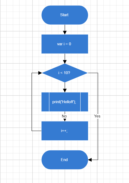
How to Create Blazor Flowchart Diagram
Create and add a Node with a specific position, size, label, and shape. Connect two or more nodes using a Connector.
@using Syncfusion.Blazor.Diagram

<SfDiagramComponent @ref="@diagram" Connectors="@connectors" Height="700px" Nodes="@nodes" />

@code
{
    SfDiagramComponent diagram;
    int connectorCount = 0;
    //Defines Diagram's nodes collection.
    DiagramObjectCollection<Node> nodes = new DiagramObjectCollection<Node>();
    //Defines Diagram's connectors collection.
    DiagramObjectCollection<Connector> connectors = new DiagramObjectCollection<Connector>();

    protected override void OnInitialized()
    {
        InitDiagramModel();
    }

    private void InitDiagramModel()
    {
        CreateNode("Start", 300, 50, NodeFlowShapes.Terminator, "Start");
        CreateNode("Init", 300, 140, NodeFlowShapes.Process, "var i = 0");
        CreateNode("Condition", 300, 230, NodeFlowShapes.Decision, "i < 10?");
        CreateNode("Print", 300, 320, NodeFlowShapes.PreDefinedProcess, "print(\'Hello!!\');");
        CreateNode("Increment", 300, 410, NodeFlowShapes.Process, "i++;");
        CreateNode("End", 300, 500, NodeFlowShapes.Terminator, "End");
        // Creates orthogonal connector.
        OrthogonalSegment segment1 = new OrthogonalSegment()
        {
            Type = ConnectorSegmentType.Orthogonal,
            Direction = Direction.Right,
            Length = 30,
        };
        OrthogonalSegment segment2 = new OrthogonalSegment()
        {
            Type = ConnectorSegmentType.Orthogonal,
            Length = 300,
            Direction = Direction.Bottom,
        };
        OrthogonalSegment segment3 = new OrthogonalSegment()
        {
            Type = ConnectorSegmentType.Orthogonal,
            Length = 30,
            Direction = Direction.Left,
        };
        OrthogonalSegment segment4 = new OrthogonalSegment()
        {
            Type = ConnectorSegmentType.Orthogonal,
            Length = 200,
            Direction = Direction.Top,
        };
        CreateConnector("Start", "Init");
        CreateConnector("Init", "Condition");
        CreateConnector("Condition", "Print");
        CreateConnector("Condition", "End", "Yes", segment1, segment2);
        CreateConnector("Print", "Increment", "No");
        CreateConnector("Increment", "Condition", null, segment3, segment4);
    }

    // Method to create connector.
    private void CreateConnector(string sourceId, string targetId, string label = default(string), OrthogonalSegment segment1 = null, OrthogonalSegment segment2 = null)
    {
        Connector diagramConnector = new Connector()
        {
            // Represents the unique id of the connector.
            ID = string.Format("connector{0}", ++connectorCount),
            SourceID = sourceId,
            TargetID = targetId,
        };
        if (label != default(string))
        {
            // Represents the annotation of the connector.
            PathAnnotation annotation = new PathAnnotation()
            {
                Content = label,
                Style = new TextStyle() { Fill = "white" }
            };
            diagramConnector.Annotations = new DiagramObjectCollection<PathAnnotation>() { annotation };
        }
        if (segment1 != null)
        {
            // Represents the segment type of the connector.
            diagramConnector.Type = ConnectorSegmentType.Orthogonal;
            diagramConnector.Segments = new DiagramObjectCollection<ConnectorSegment> { segment1, segment2 };
        }
        connectors.Add(diagramConnector);
    }

    // Method to create node.
    private void CreateNode(string id, double x, double y, NodeFlowShapes shape, string label)
    {
        Node diagramNode = new Node()
        {
            //Represents the unique id of the node.
            ID = id,
            // Defines the position of the node.
            OffsetX = x,
            OffsetY = y,
            // Defines the size of the node.
            Width = 145,
            Height = 60,
            // Defines the style of the node.
            Style = new ShapeStyle { Fill = "#357BD2", StrokeColor = "White" },
            // Defines the shape of the node.
            Shape = new FlowShape() { Type = NodeShapes.Flow, Shape = shape },
            // Defines the annotation collection of the node.
            Annotations = new DiagramObjectCollection<ShapeAnnotation>
            {
                new ShapeAnnotation
                {
                    Content = label,
                    Style = new TextStyle()
                    {
                        Color="White",
                        Fill = "transparent"
                    }
                }
            }
        };
        nodes.Add(diagramNode);
    }
}
NOTE
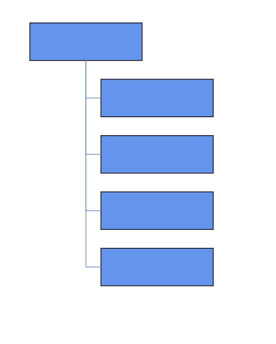
How to Create Organizational Chart
A built-in automatic layout algorithm is designed specifically for organizational charts, automatically arranging parent and child node positions for optimal structure and clarity.
@using Syncfusion.Blazor.Inputs
@using Syncfusion.Blazor.Diagram

<SfDiagramComponent Height="600px" NodeCreating="@OnNodeCreating" ConnectorCreating="@OnConnectorCreating">
    <DataSourceSettings ID="Id" ParentID="Team" DataSource="@DataSource"></DataSourceSettings>
    <SnapSettings>
        <HorizontalGridLines LineColor="white" LineDashArray="2,2">
        </HorizontalGridLines>
        <VerticalGridLines LineColor="white" LineDashArray="2,2">
        </VerticalGridLines>
    </SnapSettings>
    <Layout Type="LayoutType.OrganizationalChart" @bind-HorizontalSpacing="@HorizontalSpacing" @bind-VerticalSpacing="@VerticalSpacing" GetLayoutInfo="GetLayoutInfo">
    </Layout>
</SfDiagramComponent>

@code
{
    //Initializing layout.
    int HorizontalSpacing = 40;
    int VerticalSpacing = 50;

    //To configure every subtree of the organizational chart.
    private TreeInfo GetLayoutInfo(IDiagramObject obj, TreeInfo options)
    {
        options.AlignmentType = SubTreeAlignmentType.Right;
        options.Orientation = Orientation.Vertical;
        return options;
    }

    //Creates node with some default values.
    private void OnNodeCreating(IDiagramObject obj)
    {
        Node node = obj as Node;
        node.Height = 50;
        node.Width = 150;
        node.Style = new ShapeStyle() { Fill = "#6495ED", StrokeWidth = 1, StrokeColor = "Black" };
    }

    //Creates connectors with some default values.
    private void OnConnectorCreating(IDiagramObject connector)
    {
        Connector connectors = connector as Connector;
        connectors.Type = ConnectorSegmentType.Orthogonal;
        connectors.Style = new TextStyle() { StrokeColor = "#6495ED", StrokeWidth = 1 };
        connectors.TargetDecorator = new DecoratorSettings
        {
            Shape = DecoratorShape.None,
            Style = new ShapeStyle() { Fill = "#6495ED", StrokeColor = "#6495ED", }
        };
    }

    public class OrgChartDataModel
    {
        public string Id { get; set; }
        public string Team { get; set; }
        public string Role { get; set; }
    }
    public object DataSource = new List<object>()
    {
        new OrgChartDataModel() { Id= "1", Role= "General Manager" },
        new OrgChartDataModel() { Id= "2", Role= "Human Resource Manager", Team= "1" },
        new OrgChartDataModel() { Id= "3", Role= "Design Manager", Team= "1" },
        new OrgChartDataModel() { Id= "4", Role= "Operation Manager", Team= "1" },
        new OrgChartDataModel() { Id= "5", Role= "Marketing Manager", Team= "1" }
    };
}
You can download a complete working sample from GitHub
