How can I help you?
Getting Started with Blazor Dialog Component
16 Apr 20268 minutes to read
This section briefly explains about how to include Syncfusion® Blazor Dialog component in a Blazor WebAssembly App using Visual Studio, Visual Studio Code, and the .NET CLI.
Prerequisites
Create a new Blazor App in Visual Studio
Create a Blazor WebAssembly App using Visual Studio via Microsoft Templates or the Syncfusion® Blazor Extension. For detailed instructions, refer to the Blazor WASM App Getting Started documentation.
Prerequisites
Create a new Blazor App in Visual Studio Code
Create a Blazor WebAssembly App using Visual Studio Code via Microsoft Templates or the Syncfusion® Blazor Extension. For detailed instructions, refer to the Blazor WASM App Getting Started documentation.
Alternatively, create a WebAssembly application by using the following command in the integrated terminal (Ctrl+`).
dotnet new blazorwasm -o BlazorApp
cd BlazorApp
Prerequisites
Install the latest version of .NET SDK. If the .NET SDK is already installed, determine the installed version by running the following command in a command prompt (Windows), terminal (macOS), or command shell (Linux).
dotnet --versionCreate a Blazor WebAssembly App using .NET CLI
Run the following command to create a new Blazor WebAssembly App in a command prompt (Windows) or terminal (macOS) or command shell (Linux). For detailed instructions, refer to the Blazor WASM App Getting Started documentation.
dotnet new blazorwasm -o BlazorApp
cd BlazorApp
Install Syncfusion® Blazor packages
Install Syncfusion.Blazor.Popups and Syncfusion.Blazor.Themes NuGet packages in your project using the NuGet Package Manager in Visual Studio (Tools → NuGet Package Manager → Manage NuGet Packages for Solution), or the integrated terminal in Visual Studio Code (dotnet add package), or the .NET CLI.
Alternatively, run the following commands in the Package Manager Console to achieve the same.
Install-Package Syncfusion.Blazor.Popups -Version 33.2.3
Install-Package Syncfusion.Blazor.Themes -Version 33.2.3
NOTE
All Syncfusion Blazor packages are available on nuget.org. See the NuGet packages topic for details.
Add import namespaces
After the packages are installed, open the ~/_Imports.razor file and import the Syncfusion.Blazor and Syncfusion.Blazor.Popups namespaces.
@using Syncfusion.Blazor
@using Syncfusion.Blazor.Popups
Register Syncfusion® Blazor service
Register the Syncfusion® Blazor service in the Program.cs file of your Blazor WebAssembly App.
....
using Syncfusion.Blazor;
....
builder.Services.AddSyncfusionBlazor();
....
Add stylesheet and script resources
The theme stylesheet and script can be accessed from NuGet through Static Web Assets. Include the stylesheet and script references in the ~/index.html file.
<link href="_content/Syncfusion.Blazor.Themes/fluent2.css" rel="stylesheet" />
....
<script src="_content/Syncfusion.Blazor.Core/scripts/syncfusion-blazor.min.js" type="text/javascript"></script>
NOTE
Check out the Blazor Themes topic to discover various methods (Static Web Assets, CDN, and CRG) for referencing themes in the Blazor application. Also, check out the Adding Script Reference topic to learn different approaches for adding script references in the Blazor application.
Add Syncfusion® Blazor Dialog component
Add the Syncfusion® Blazor Dialog component in the ~/Pages/Index.razor file.
@using Syncfusion.Blazor.Popups

<SfDialog Width="250px">
    <DialogTemplates>
        <Content> This is a Dialog with content </Content>
    </DialogTemplates>
</SfDialog>- Press Ctrl+F5 (Windows) or ⌘+F5 (macOS) to launch the application. This will render the Syncfusion® Blazor Dialog component in the default web browser.

NOTE
- In the dialog control, max-height is calculated based on the dialog target element height. If the Target property is not configured, the document.body is considered as a target. Therefore, to show a dialog in proper height, you need to add min-height to the target element.
NOTE
- If the dialog is rendered based on the body, then the dialog will get the height based on its body element height. If the height of the dialog is larger than the body height, then the dialog’s height will not be set. For this scenario, you can set the CSS style for the html and body to get the dialog height.
html, body {
   height: 100%;
}
NOTE
Created and Destroyed Events
-
The Created event fires when the dialog is initialized and rendered in the DOM.
-
The Destroyed event triggers when the dialog component is removed from the DOM. These lifecycle events allow executing custom code at specific points in the component’s existence.
@using Syncfusion.Blazor.Popups

<SfDialog>
    <DialogEvents Created="@CreatedHandler" Destroyed="@DestroyedHandler"></DialogEvents>
</SfDialog>
@code {

    public void CreatedHandler(Object args)
    {
        // Here, you can customize your code.
    }

    private void DestroyedHandler()
    {
        // Here, you can customize your code.
    }
}
Prerender the Dialog
The AllowPrerender property controls how the dialog DOM elements are handled when the dialog is hidden. Understanding this property is crucial for optimizing performance in your application.
- By default, AllowPrerender is set to false. In this mode, dialog DOM elements are completely removed from the DOM when the dialog is hidden, and recreated each time the dialog is shown. This approach saves memory but requires re-rendering on each display.
- When AllowPrerender is set to true, the dialog elements remain in the DOM even when hidden, which improves performance for frequently accessed dialogs but uses more memory.
@using Syncfusion.Blazor.Popups
@using Syncfusion.Blazor.Buttons

<div id="target">
    <div>
        <button class="e-btn" @onclick="@OnBtnClick">Open</button>
    </div>
    <SfDialog Target="#target" Width="300px" ShowCloseIcon="true" @bind-Visible="Visibility" AllowPrerender="true" Header="AllowPrerender Dialog" Content="This is a dialog with content">
    </SfDialog>
</div>
<style>
    #target {
        height: 500px;
    }
</style>
@code {
    private bool Visibility { get; set; } = false;
    private void OnBtnClick()
    {
        this.Visibility = true;
    }
}Set Header to Dialog
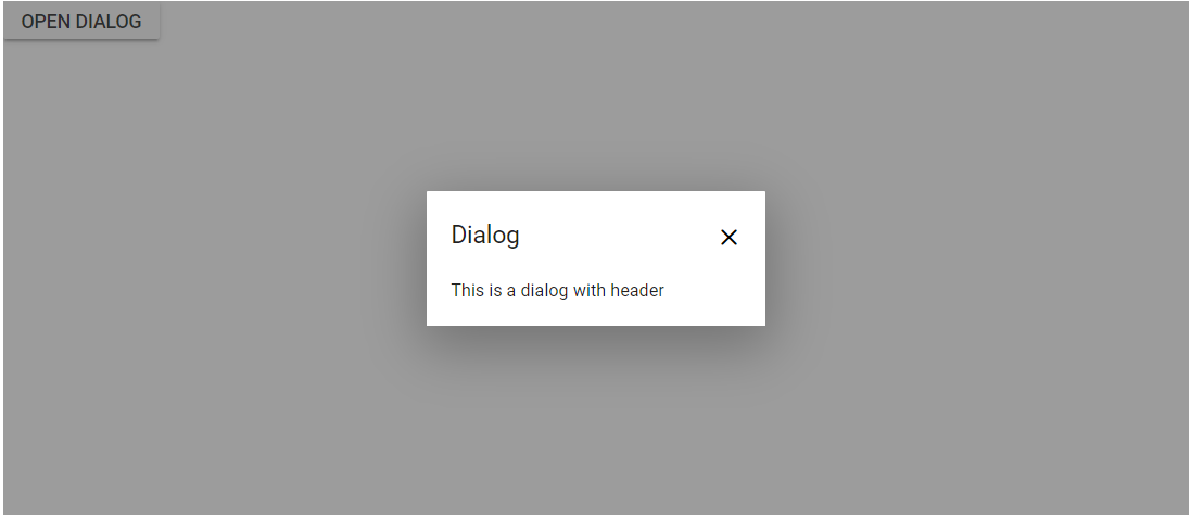
The Header property allows rendering a dialog with custom text header.
@using Syncfusion.Blazor.Popups

<SfDialog Width="250px" Header="Dialog Header"></SfDialog>
Set Content to Dialog
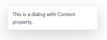
The Content property allows rendering a dialog with custom text content.
@using Syncfusion.Blazor.Popups

<SfDialog Width="250px" Content="This is a dialog with Content property."></SfDialog>
See also
-
Getting Started with Syncfusion® Blazor for client-side in .NET Core CLI
-
Getting Started with Syncfusion® Blazor for server-side in Visual Studio
-
Getting Started with Syncfusion® Blazor for server-side in .NET Core CLI
NOTE
You can also explore our Blazor Dialog example that shows you how to render and configure the Dialog.