Getting Started with Blazor TextBox in Blazor Web App
9 Jul 20267 minutes to read
This section briefly explains how to include the Blazor TextBox component in your Blazor Web App using Visual Studio, Visual Studio Code, and the .NET CLI.
Create a new Blazor Web App
Create a Blazor Web App using Visual Studio via Microsoft Templates or the Blazor Extension. For detailed instructions, refer to the Blazor Web App Getting Started documentation.
Run the following command to create a new Blazor Web App.
dotnet new blazor -o BlazorWebApp --interactivity Auto
cd BlazorWebApp
cd BlazorWebApp.Client
Alternatively, create a Blazor Web App using Visual Studio Code via Microsoft Templates, the Blazor Extension, or the C# Dev Kit extension.
Run the following command to create a new Blazor Web App.
dotnet new blazor -o BlazorWebApp --interactivity Auto
cd BlazorWebApp
cd BlazorWebApp.Client
NOTE
Configure the appropriate Interactive render mode and Interactivity location while creating a Blazor Web App. For detailed information, refer to the interactive render mode documentation.
Install the required Blazor packages
Install Syncfusion.Blazor.Inputs and Syncfusion.Blazor.Themes NuGet packages. All Syncfusion Blazor packages are available on nuget.org. See the NuGet packages topic for details. If using the WebAssembly or Auto render modes in the Blazor Web App, install these packages in the .Client project.
- Go to Tools → NuGet Package Manager → Manage NuGet Packages for Solution.
- Search for the required NuGet packages (
Syncfusion.Blazor.InputsandSyncfusion.Blazor.Themes) and install them.
Alternatively, you can install the same packages using the Package Manager Console with the following commands.
Install-Package Syncfusion.Blazor.Inputs -Version 34.1.29
Install-Package Syncfusion.Blazor.Themes -Version 34.1.29
Open the terminal and run the following commands.
dotnet add package Syncfusion.Blazor.Inputs -v 34.1.29
dotnet add package Syncfusion.Blazor.Themes -v 34.1.29
Open the command prompt and run the following commands.
dotnet add package Syncfusion.Blazor.Inputs -v 34.1.29
dotnet add package Syncfusion.Blazor.Themes -v 34.1.29
Add import namespaces
After the packages are installed, open the ~/_Imports.razor file in the client project and import the Syncfusion.Blazor and Syncfusion.Blazor.Inputs namespaces.
@using Syncfusion.Blazor
@using Syncfusion.Blazor.Inputs
Register the Blazor service
Open the Program.cs file in the Blazor Web App and register the Blazor service. If the Interactive Render Mode is set to WebAssembly or Auto, register the Blazor service in Program.cs files of both the server and client projects in your Blazor Web App.
....
using Syncfusion.Blazor;
....
builder.Services.AddSyncfusionBlazor();
....
Add stylesheet and script resources
The theme stylesheet and script can be accessed from NuGet through Static Web Assets. Include the stylesheet and script references in the App.razor file.
...
<link href="_content/Syncfusion.Blazor.Themes/fluent2.css" rel="stylesheet" />
...
<script src="_content/Syncfusion.Blazor.Core/scripts/syncfusion-blazor.min.js" type="text/javascript"></script>
Add Blazor TextBox component
Open a Razor file located in the ~/Pages/*.razor (for example, Home.razor) and add the Blazor TextBox component inside the razor file.
NOTE
If the interactivity location is set to
Per page/componentin the Web App, define a render mode directive at the top of the razor file (for example,@rendermode InteractiveServer,@rendermode InteractiveWebAssembly, or@rendermode InteractiveAuto). If the Interactivity is set toGlobalwithAutoorWebAssembly, the render mode is configured automatically in theApp.razorfile by default.
@rendermode InteractiveAuto
@using Syncfusion.Blazor.Inputs
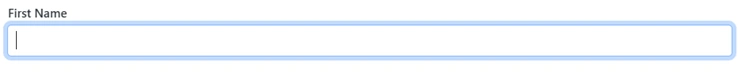
<SfTextBox Placeholder='First Name'></SfTextBox>Run the application
Press Ctrl+F5 (Windows) or ⌘+F5 (macOS) to launch the application. The Blazor TextBox component will render in your default web browser.
Open the terminal and navigate to the main project folder (for example, BlazorWebApp) and run the following command.
cd ..
cd BlazorWebApp
dotnet run
Open the command prompt and navigate to the main project folder (for example, BlazorWebApp) and run the following command.
cd ..
cd BlazorWebApp
dotnet run
NOTE
Adding icons to the Blazor TextBox
Add an icon to the TextBox using the AddIconAsync method. The following example shows how to append an icon.
@rendermode InteractiveAuto
@using Syncfusion.Blazor.Inputs

<div id="sample" style="margin:130px auto;width:300px">
    <SfTextBox @ref=@TextBoxDropDownObj
               Created="@AddDateIcon"
               Placeholder="Enter Date"
               FloatLabelType="@FloatLabelType.Auto">
    </SfTextBox>
</div>


@code {
    SfTextBox TextBoxDropDownObj { get; set; }

    private async void AddDateIcon()
    {
        if (TextBoxDropDownObj != null)
        {
            //Add icon to the TextBox
            await TextBoxDropDownObj.AddIconAsync("append", "e-icons e-date-icon");
}
    }
}
Floating label
The floating label moves the label above the TextBox when the control is focused or contains a value. Enable the floating label by setting the FloatLabelType property.
@using Syncfusion.Blazor.Inputs

<SfTextBox Placeholder='First Name' FloatLabelType='@FloatLabelType.Auto'></SfTextBox>